The Stampscapes® 101: 9-Step Thumbnail Grid
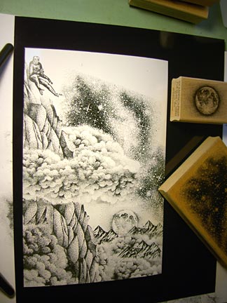
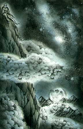
Grump on the Hill
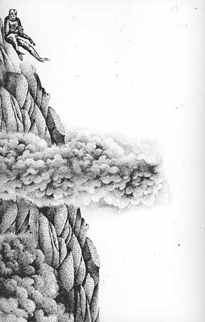
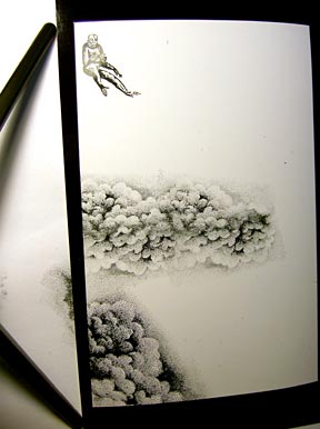
1) Grouch by Yes Pigs Can Fly was stamped in black. Cloud Cumulus 018E was stamped in black two times "up" and twice "down". That created a two sided cloud in the middle of the scene. Cloud Cumulus Lg 019G was stamped in black at the bottom of the scene. The clouds were masked off with simple ripped paper towels and Ledge 054F was stamped three times creating the rocky perch for the Grouch figure. From one impression to the next, each ledge doesn't require masking. Just overlap them.
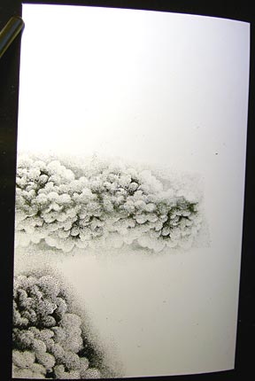
Start off with your clouds. These are going to be in the front of my ledge so they'll go first and I'll mask them off later.
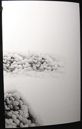
My cloud is going to be double sided so I'm stamping it upside down here, connecting it up with the bottom side of the initial cloud impressions.
After two of these upside down connecting impressions the cloud now looks like this.
The "Grouch" is positioned.
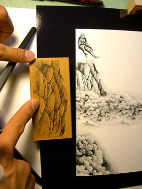
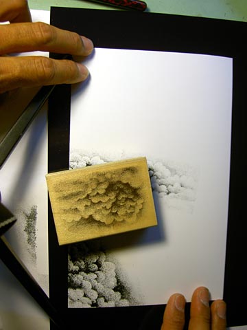
This is the area of the Ledge that I used in this spot between the Grouch and the Cloud. I masked off the cloud with a paper towel and just wiped off some of the ink on the ledge where I knew I would be getting close to the legs of the figure. After this step, I would mask the bottom side of the cloud and also the lower left cloud and put the ledge impressions below.
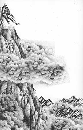
2) I thought the scene could use some depth so I wrapped the cloud around the Ledge. I did this by masking the cloud (middle of the scene) and masking the Ledge. A small portion of the same Cloud Cumulus 018E was stamped. Scale and distance were pushed by layering Rocky Peaks Sm 211C and Cloud Cumulus 018E at the bottom of the scene.
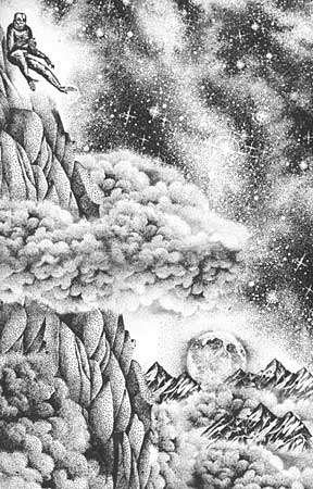
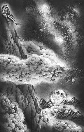
3) I had debated on whether or not to do this to the sky but, in the end, I decided to go with Milky Way Lg 059G for the main celestial element. In this scene, it's been stamped about four times. With this image, you'll want to overlap and slightly change the angle from impression to impression. Don't stack it like bricks or it will look like bricks. See our image lesson section for additional details on this stamp. The clouds and ledge were masked before stamping the image. Full Moon Lg was stamped over the lower Rocky Peaks.
Mask out the clouds and build the Milky Way background. Notice how I've changed the angle of the Milky Way from one impression to the next. I've positioned the actual stamp in this photo to show the angle that the impression to the left of it was made in. The one above it was less angled. Angle and overlap.
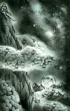
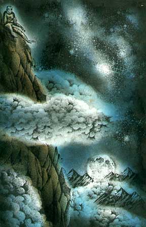
4) Here's where this scene deviates from many of the scenes that you see in the lessons section. Typically, I'll start toning a scene with light colors and progressively work darker. I've been playing around with black and white scenes for a while and monochromatic compositions so I wanted to explore this more. Kind of an extension on a process they do in a method of oil painting. Full tonal monochromatic compositions and then layering transparent oil glazes over them. In this case, I'll add transparent dye based inks.
What I was going for in this "tonal rendering" was to bring illumination to certain objects. I wanted the hovering cloud to be top and bottom lit so I put a slight grey tone in the middle of it. Some stars were brought out by sacrificing others to the black and grey tones. Looking back at this step, I'm wondering if I took this toning process too far. I typically don't worry about this though as I know I can add things like gel pen highlights back into the scene later.
Toning in the scene. At this moment I was working around some stars trying not to lose them all by applying ink, or too much ink, to them.
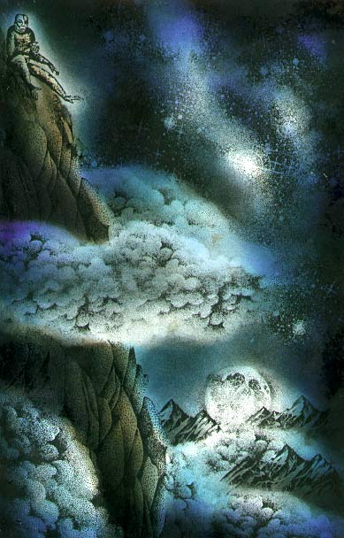
5) With the Stylus Tool, Ranger Industries Sea Shell "Cloudy Blue" was added to the scene. I was careful not to tone everything. For example, I wanted the strongest illumination to be in certain areas of the clouds so I left them the white of the paper.
6) With the Stylus Tool, Ranger Industries Distress Ink "Old Paper" was used on the rocks, mountains, and part of the sky. I wanted to give a different look to the blue tones. Kind of a dirty blue tone. Marvy #60 Salvia Blue was used to deepen the blue.
7) With the Stylus Tool, Ranger Industries Distress Ink "Walnut Stain" was used on the rocks, mountains, and part of the sky. I wanted to create a stronger separation between land and sky by bringing this deeper warm tone into the mix. Marvy #10 Light Blue was added to the sky for brightness.
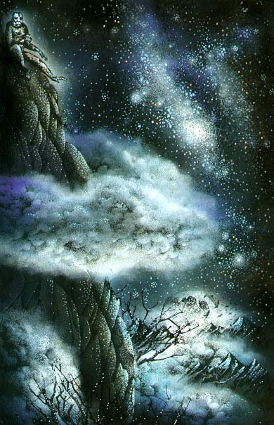
8) With the Stylus Tool, Ranger Industries Adirondak "Denim", Marvy #3 "Blue" and #29 "Prussian Blue" was used in the sky. I added these all in one step as they're all doing basically the same thing here. Adding the deepest of shadow areas to the sky and land forms.
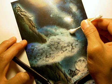
9) Colorbox "Frost White" Pigment ink was added to the clouds to give a misty soft appearance. Ink added with a Cotton Swab (Q-Tip/Ear cleaner). For glowing stars, I dabbed a spot of diffused pigment ink (dry dabbing) and then added a dot of gel pen in the middle of the dot. Using gel pens in assorted colors, highlights were added to the rocks to reiterate light direction and to add a texture, stars, and sparkle to the night sky. I used white, blue, metallic copper, and pale green gel pen highlights to the scene.

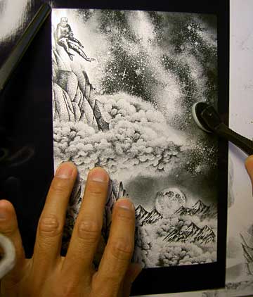
Applying some ink to the clouds. Make sure you don't use too much pigment ink when doing this or you'll get globs. Getting globs? Tap most of it off before applying.
Dabbing. Dabbing. Add your ink slow and in LAYERS. Don't try and apply too much too fast.
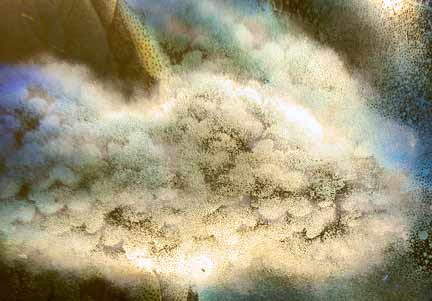
Close up of the cloud. See the soft perimeter and the translucent effect from very light layers of pigment ink applied.

Pigment ink applied on all clouds. After this step I added the gel pen highlights.