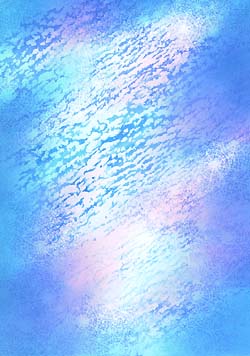
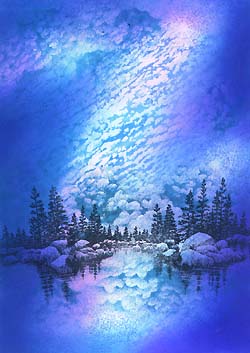
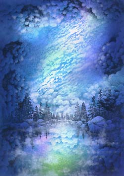
Vapor
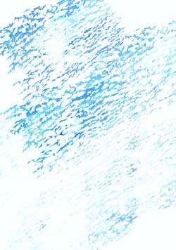
Cloud (Altocumulus) Lg-194G was stamped in multiples --overlapping slightly. Colour: Marvy Light Blue #10 & Manganese Blue #36 and Markers.
Star Cluster-118E was stamped in multiples. Colour: Marvy Blue #3.
Note: I stamped the image here and there leaving some areas w/o the
stars for variation in surface.
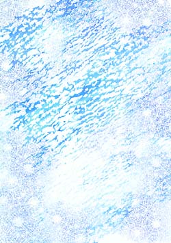
Tone is added using the The Tonal Applicator-084E being careful not to stamp out all of the clouds and stars. Colour: Marvy Manganese Blue #36.
Note: What I always stress in my workshops is to begin the color application process --in this technique-- with the lightest colors they can find within the color scheme they wish to achieve. The first reason is because it makes the color blending as simple as possible. The second reason is because, quite often, the lightest colors give the darker colors --still to come-- something to "sit on" (a foundation). Dye-based colors are transparent so the under colors will always have an effect on anything that's laid on top of them (e.g. Yellow under blue will result in a greenish appearance. Light blue under a different blue will most likely result in a richer blue than if either were used alone).
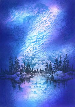
Second tone is added over the first coat of blue. Colour: Marvy Light Blue #10.
Note: Light Blue #10 isn't much darker than Manganese Blue. This is key for blending ease. For the first coating of ink, Ocean Aqua wasn't much darker than the white of the page. The same is so for each progressively darker color to come. I can't stress enough how much this process is simplified by taking each step a very small one. It makes the blending of color easy, and in the end, makes the cards so much richer by building up tone as opposed to rushing into the darker values. Lay your colors out in front of you before blending, and your eye will tell you if it's going to be a smooth transition from color to color. In other words, try not to jump from one color to a color that's much darker in one step --if you can avoid it.
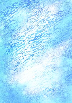
A third tone is added. Colour: Marvy Rose Pink #59.
Note: The Rose Pink begins to take the blues into a violet/blue scheme where the colors overlap. In some areas, I left the white of the paper. By not stamping the blue into them, the pink stays its pure color.
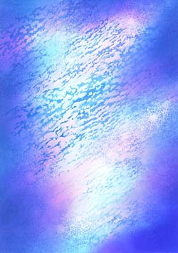
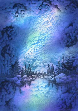
A fourth tone is added. Colour: Marvy Pale Violet #31 .
Note: The composition moves into the darker values with this addition.
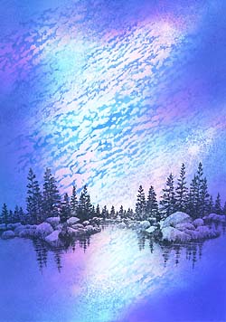
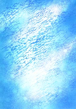
Lakeside Cove-048E and Lakeside Cove Lg.-049G are added. Colour: Marvy Black #1.
Note: 048E has been added in the center of the composition with the
sides of Lakeside Cove Lg.-049G-- used to each side of the smaller version.
Cloud Cumulus-018E was stamped for extra texture in the sky.
Colour: Marvy Light Blue #10.
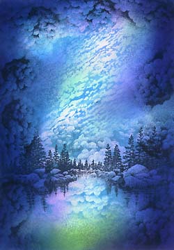
A fifth tone is added. Colour: Marvy Blue #3.
Note: Continuing the blending and darkening process, blue is used.
A sixth tone is added and more impressions of Star Cluster-118E are stamped. Colour: Ranger Industries Adirondack Denim.
Note: I lost a lot of the Stars with the toning process so I went
back in and stamped them in a darker color to bring back the shapes
into the present state of the card. I had to use a fairly dark color
in the denim because the background was fairly dark at this time.
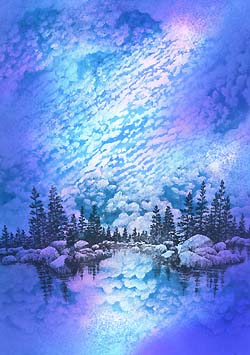
A seventh tone is added with the Tonal Applicator-084E in Marvy Pale Green #34 and Cloud Cumulus-018E is stamped again but this time in Black.
Note: I wanted to introduce another hue into the color scheme for
visual interest. The clouds were added in a darker color yet for
more distinct shapes and to extend the value range.
An eighth tone is added. Colour: Ranger Industries Adirondack
Denim. Also, Marvy Light Green #11 was added to the water for extra brightness to that area.
Colorbox White pigment ink was used in a dabbing motion --using a
cotton swab in various areas of the scene. The soft application added a
mist to the surface of the lake, softened and lightened the clouds,
and gave a foggy appearance between the viewer and the distant trees.
In this very thin application of the ink, there isn't a drying
problem in regards to pigment ink on glossy paper. (Also see Lake &
Moon 9-step --scene 9-- for additional notes on this process).
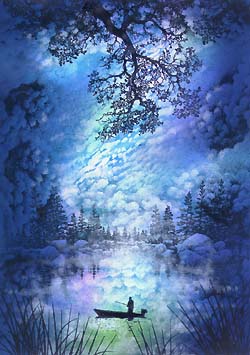
Oak Branch-203G, Reeds Lg.-068D, and Fisherman in Boat-187B have been added. Colour: Memories Black ink pad.
Note: I thought the Memories Black would be the best choice for these
images as the ink is fairly thick, and I didn't want to take the
chance of some of the Colorbox white showing through these black
images.
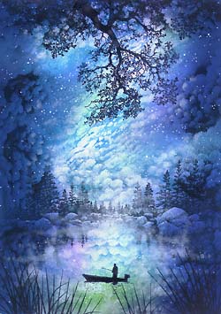
White dots are applied to scene using a Pentel Milky Gel Roller. Colour: White.
Note: The tool I love to finish my scenes off with is a white pen, and
now with the easy-to-use Gel Rollers, I can do this in multiple colors
if I wish. Here the dots are used to represent stars, highlights on
the tops of billowing clouds and rocks with sparkles on the lake's surface.