Blue Mill
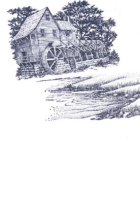
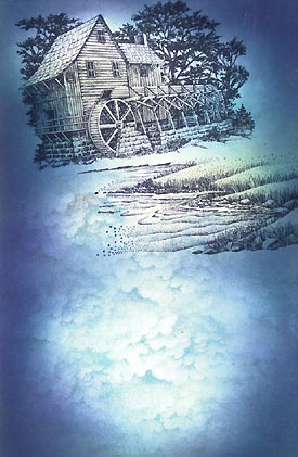
Water Mill Lg.-143G and Waterside Bluff Right-149F were stamped in black.
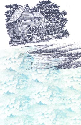
Cloud Cumulus-018E was stamped in Ranger Industries (R.I.) Sea Brights Pool. Overlap and change the angle of each impression to avoid a look that's too symmetrical in appearance.
The Tonal Applicator-084E was used in R.I. Sea Shells Ocean Aqua. The Sea Shells line are good colors to begin with when it comes to using the Tonal Applicator. They're very light values and set nice foundations for the progressively darker colors that we build up in the process.
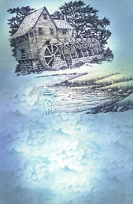
The Tonal Applicator-084E was used in R.I. Sea Shells Sea Grass on the bluff and in R.I. Vintage Ink "Ocean".
The Tonal Applicator-084E was used in R.I. Sea Shells Sandal on the Water Mill-143G and in R.I. Vintage Ink "Spring Floral". The rooftop of the Water Mill was mostly left untouched. There might have been some very light applications of color applied with a dry Tonal Applicator but most of the color was on the side of the mill. The idea is to turn the object in space meaning we're defining the direction of light through tone. In this case, it says that the light is coming from above. If we used uniform tone over the entire mill it would flatten out the object.
The Tonal Applicator-084E was used in R.I. Adirondack Stream. With these darker tones remember to regulate your usage of the Tonal Applicator. Keep to the outside of the card for a longer duration before moving/tapping it in.
The Tonal Applicator-084E was used in R.I. Adirondack Denim.
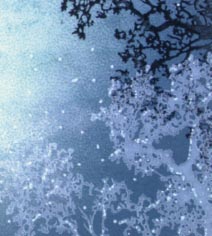
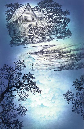
Oak Branch-203G was stamped three times and Jumping Bass Lg-047B once in black.
Oak Branch-203G was stamped in Colorbox Frost White & a White Pentel Milky Gel Roller pen was used to add stars, water surface highlights, and other detail to the scene. The Colorbox line is a pigment ink line. I know what you're thinking --they don't dry on glossy paper. I've used them in light coats with a cotton swab application but never "image stamped" on glossy. I wanted to bring opaques into the mix with this scene so I just sprayed a light coat of Krylon Crystal Clear over it, and it seemed to do the trick. Note: You want just that --a light coat. When you give it too strong of a coat, the inks tend to disappear into translucency/transparency.
Additional dots of light were added with the White Pentel Milky Gel Roller pen. I wanted to bring out the white Oak Branches a little more so highlights did the trick.
To make things a little softer and to add a mist/haze in areas, a Frost White Color Box pigment pad was used with a cotton swab dabbing application. Note: Take a lot of the pigment inks off of the cotton swabs by dabbing them off before applying to paper. It's like semi-dry brushing. I applied the ink around the base of the Watermill and the Jumping Bass Lg. to put them in a fog and to give the two subjects something in common for overall unity. Mist now rises from the water along the banks of the river with this technique. For additional opacity, apply the pigment inks in layers, waiting for each layer to dry before applying the next. Again, if you spray them with Krylon to expedite drying, be careful to do it lightly (just enough to make it dry to the touch) otherwise it will render the inks transparent.
