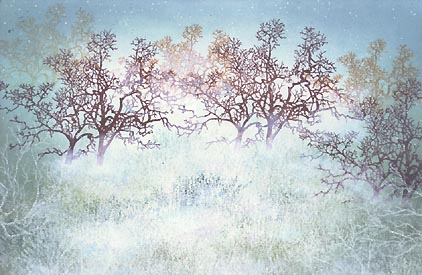
Oaks and Fog
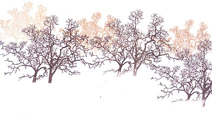
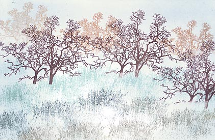
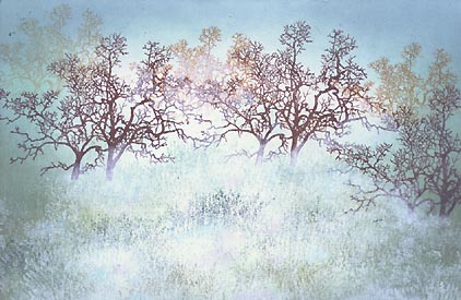
Oak Tree (Large)-179G was stamped in Ranger Industries (R.I.) Vintage Apple Cinnamon and Oak Tree (Medium)-178E was stamped in (R.I.) Archival Sepia.
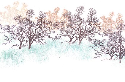
Grass Texture-208D was stamped in R.I. Vintage Ocean seven or eight times.
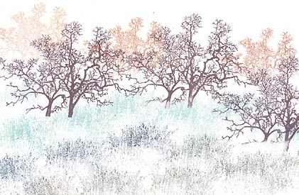
Grass Texure was stamped again this time in R.I. Adirondack Bottle & Pesto. Stamping this image in multiple values can add to the variation/richness of the scene.
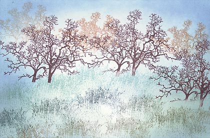
The Tonal Applicator-084E was used in R.I. Sea Shells Cloudy Blue. The Sea Shells line are good colors to begin with when it comes to using the Tonal Applicator. They're very light values and set nice foundations for the progressively darker colors that we build up in the process.
The Tonal Applicator-084E was used in R.I. Sea Shells Starfish Green in the grass and R.I. Vintage Ink Spring Floral in the sky and grass. Note: The area toward the center of the grass and sky were left lighter than the edges of the card to create a framed appearance and to allow for a wider value range than if it was completely covered in uniform tone.
The Tonal Applicator was used in R.I. Adirondack Pesto on the grass and R.I. Vintage Ink Ocean in the sky and grass. Pesto kind of gave the surrounding tone and trees something in common while pushing the tonal range a step further (darker).
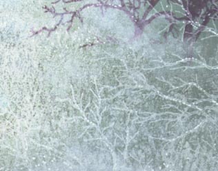
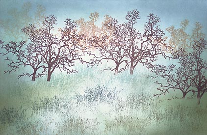
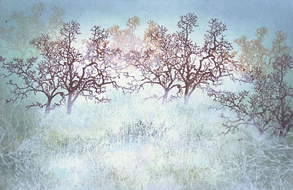
Grass Texture-208D was stamped in Colorbox Frost White. I just kind of dabbed this image around. I didn't go for the entire image impression. The Colorbox line is a pigment ink line. I know what you're thinking --they don't dry on glossy paper. I've used them in light coats with a cotton swab application but never "image stamped" on glossy. I wanted to bring opaques into the mix with this scene so I just sprayed a light coat of Krylon Crystal Clear over it and it seemed to do the trick. Note: You want just that --a light coat. When you give it too strong of a coat, the inks tend to disappear into translucency/transparency.
Using a cotton swab in a semi-dry brush dabbing application, cloudy areas were added to the scene using Colorbox Frost White and a little Heliotrope (purple). The idea was to create the look of mist hovering over the ground. Some areas were left w/o the white application --for variation.
Crooked Limb-097E was stamped to each side of the lower edges using Colorbox Frost White. Again, you'll have to spray it with Krylon or let it dry for a long time if you do this.
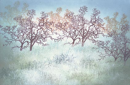
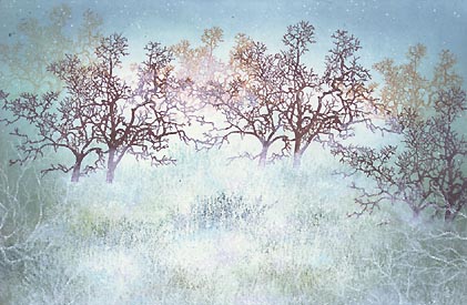
A White Pentel Milky Gel Roller was used to add highlights to the sky, branches, trees and grass.
Using a cotton swab in a semi-dry brush dabbing application additional white tone was applied using Colorbox Frost White. I wanted to get just a little more light/mist into the scene so the white was built up a little more. What happens is that as you put this ink down in this fashion it builds up from a translucent layer into opacity the with each layer that's applied. This is good as you have more control over it than if it went on completely opaque. Easier to build it up gradually. Don't try to rush it.
