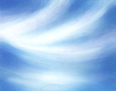
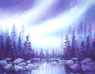
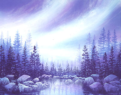
Wisps in Blue

The Colorbox Stylus Tool was used in a Ranger Industries (R.I.) Sea Shells Ocean Aqua. I'm just getting a basic, wispy pattern down at this point in time by leaving some areas the white of the cardstock. The Sea Shells line is so light that you don't need to worry about making a mistake. We're starting out very vague here with what will eventually be more definitive cloud formations. So, don't worry about getting things perfect.
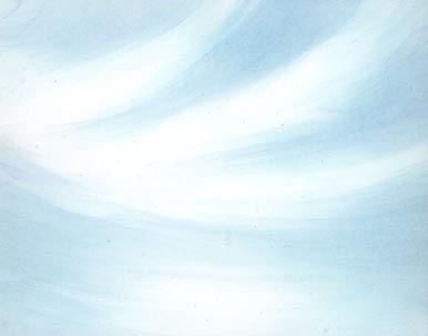
Stylus Tool: R.I. Sea Shells Cloudy Blue darkened the wisps a touch. Note: Go with the contours of each arch in the same wispy motion. On the top of the scene, place your stylus tool down on to the paper and "wisp" it downward lifting it off the page in that motion. This way it drags that color and leaves a thinner lighter tail. We don't want a blob at the end of where it tails off.
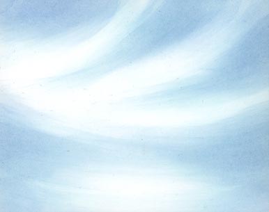
Stylus Tool: Marvy Salvia Blue #60 darkened and defined the negative shapes (that define the clouds) a little more.
Stylus Tool: Ranger Industries (R.I.) Sea Brights Sailboat Blue. Getting a little darker here. You can see, more clearly, the dragging motion being applied.
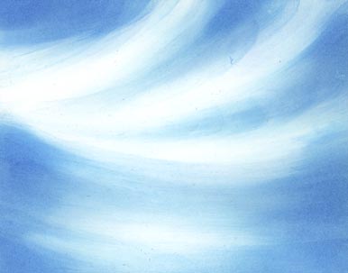
Stylus Tool: (R.I.) Sea Shells Cool Peri. I wanted to start turning the color away from being merely straight gradations of blue. This color adds a touch of a violet element.
Stylus Tool: Marvy Light Blue #10 was used in some of the darker areas of the sky. It's not a big difference in appearance from the previous color used, but that's the secret. Build your color up gradually in this technique and media (dye-based colors on glossy paper). It makes the process much easier and the end result richer.
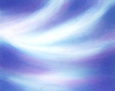
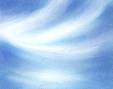
Stylus Tool: Marvy Pale Violet #31 was added throughout the sky. Some of this color was added in the areas that were still white from the cardstock. In those areas, you can see more of the pure form of the violet.
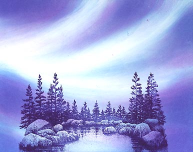
Lakeside Cove lg.-049G was stamped in a Marvy Prussian Blue #29. I decided to stay with the color scheme for the image.
The sides of Lakeside Cove lg.-049G were stamped in the Prussian Blue to each side of the initial impression to continue the tree line.
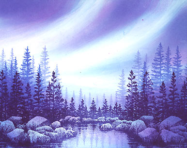
There wasn't quite enough depth in the scene for me so I stamped Pine Row-150E in two different colors --R.I. Sea Brights Sailboat Blue and Stamp It Blue. The lighter background trees are from the Stamp It pad. For the smallest background trees, in the center of the cove, I used this color again. So what we have working here is, basically, three layers of images --three layers of colors. Prussian Blue would be the images closest, Sailboat Blue would be the middle-ground trees, and Stamp It Blue would be the background trees in the deep background. Generally in this technique (not a rule) -- darker = closer.
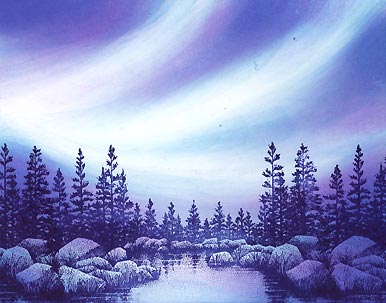
Cotton swab: Using a dry brush, touch with [pigment inks from] Colorbox Frost White and a Brilliance Pad Moonlight White I wisped some opaque inks into the cloud area for added texture and motion. The translucent pigment was just perfect for some added vapor up there. Trail off some of this ink from the clouds into the darker areas of the sky and off the edge of the page. If you don't like some things that happen with these motions, just wipe them off and start over. The pigment inks won't smear the dye-based colors/inks. There's a touch that you have to use doing this. What happens is the inks will just wipe clean off the glossy card stock if you use too much pressure. If you use too little, the ink won't seem to take to the paper. If you're dabbing, you can build the color up, but this wisping/wiping motion can pull. It's a fun touch for that added vapor.
Add highlights to your scene with Milky Gel Rollers. In this case, Pentel pastel colors in white and blue were used. These colors relate to the color scheme used with the dye-based inks. I used them in the trees, water, and rocks. For the first time, I stayed away from the sky area with these pens. I thought I would let the vaporous area speak for itself -- a pretty fun way to do a sky.