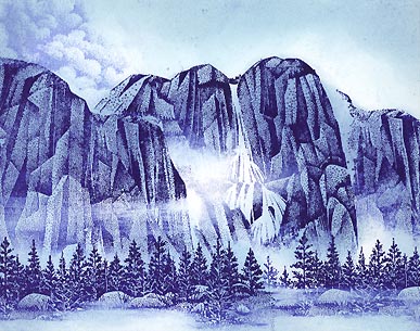
Mountain Clouds
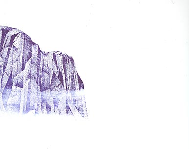
Tall Rock Lg. 080G was stamped out in a Marvy #29 "Prussian Blue". I streaked off some of the ink with a paper towel before stamping it out. Some trees were going to be added at the base of the rocks later on and a lighter gradation in the Tall Rock Lg. base would allow them to read better.
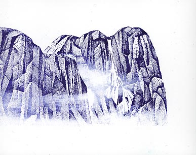
Mask out the Tall Rock Lg. and stamp Tall Rock w/Falls Lg. 082G out in "Prussian Blue". Before stamping the Falls an area was wiped off almost completely of the ink. This area would read as the cloud. Again, the ink on the base of the rocks was mostly wiped off before stamping.
Tall Rock Lg. was stamped to the right of the Tall Rock w/Falls Lg. to finish off the mountain line. Meadow Lg. 057G was stamped twice on the bottom of the scene. Here you can see why the bottom part of the mountains were stamped lighter. The silhouettes/shapes of the trees can read better than to stamp them against the dark patterns of the Tall Rock images.
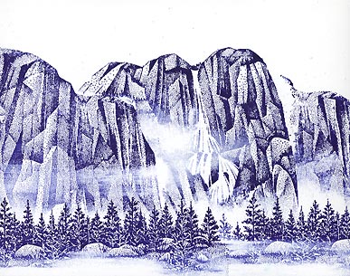
Cloud Cumulus 018E was stamped in a Stamp It "Blue" pad. Using a Colorbox Stylus Tool, a Ranger Industries (R.I.) Sea Shells "Ocean Aqua" was applied to the scene. Some of the clouds in the scene were left the white of the paper.
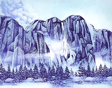
Stylus Tool: R.I. Sea Shells "Cloudy Blue" darkened the areas a little more.
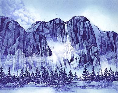
Stylus Tool: Stamp It "Blue" was added. Here, we're starting to see the shading scheme come into focus. To get variations of value in the scene, as the shading colors get darker, I don't color quite as much as I did with previous colors. For example you can still see some of the lighter shades of blue in the scene because I didn't tone over them with this darker color.
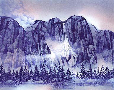
Stylus Tool: R.I. Sea Shells "Seashell Pink" was added. This pink doesn't read as pink throughout the scene because it overlaps the blues. Where it encounters the white of the paper it does read as pink.
Stylus Tool: Marvy #31 "Pale Violet" was added. Mountains are becoming very defined here. The darker the area surrounding the clouds become, the lighter the clouds appear by contrast.
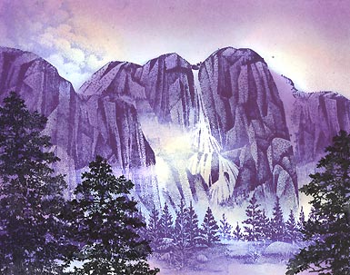
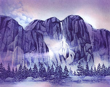
Stylus Tool: R.I. Sea Shells "Conch Shell" was added to the cloudy areas. Conch is like a pale warm peach color so it warms these areas right up. The Sea Shells line is so light in value that you can practically color it right into your scene in this manner straight from the pad on to the paper. In other words you don't need to blot the color off to lighten it up for more control. This could be an issue if you were using a darker warm color as the colors, already on the scene, are all cool. This warm over cool could clash if the values aren't right. So going light with the Sea Shells line takes care of this factor.
Twisting Pine 222F was added in a Marvy #1 "Black". It was stamped three times and at different heights for variation.
Q-Tip: Using a "dry brush" touch with [pigment inks from] Colorbox "Frost White" and a Brilliance Pad "Moonlight White" the clouds were defined a little more and fog was added to the meadow and distant trees.
Add highlights to your scene with Milky Gel Rollers. In this case Pentel white was used. It's hard to see in this scan but some highlights were added on the the Tall Rocks, Meadow trees and rocks, and especially the foreground trees.