Shimmering in Green
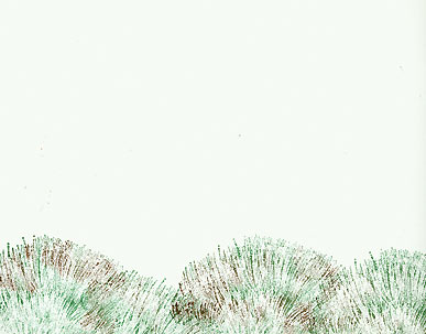
Tall Grass 253D: Four impressions were stamped across the bottom. Colors blended directly on stamp with Marvy Pens: #72 Pine Green, #6 Brown.
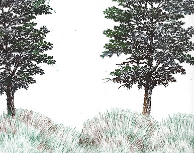
Shagbark Hickory 242G: Two impressions were stamped. Colors blended directly on stamp with Marvy Pens: #72 Pine Green, #6 Brown, #18 Dark Brown, #25 Bottle Green, #11 Light Green. Note: the light green color was applied to the inner edges of the tree limbs. I figured the light would be coming from in between the trees so those branches were made a little lighter.
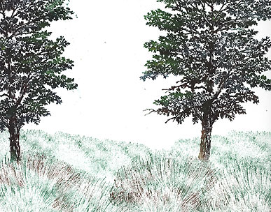
Tall Grass sm 254B: About five impressions were stamped to start building up the grassy distance. Color -Marvy #72 Pine Green.
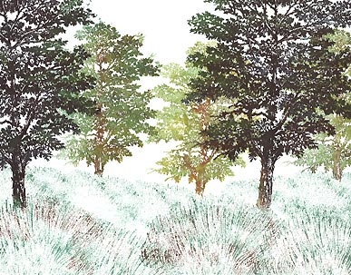
Shagbark Hickory sm 241E: Three impressions were made. Colors blended directly on stamp with Marvy Pens #13 Ochre, #34 Pale Green, #70 (don't know the name but it's like a light mint green). Note: each tree was stamped below the grass line --by masking off the grass line. Also, some ink was removed from the stamps before making the impressions especially around the edges. I wanted the edges to be soft as if they were catching some light.
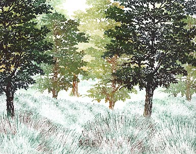
Shagbark Hickory sm 241E: About three impressions were made. Colors blended directly on stamp with Marvy pens #13 Ochre & #70. Note: I wanted these impressions to be very light so as not to obscure the forms of the closer trees so I blotted the stamps off once before making my impressions.
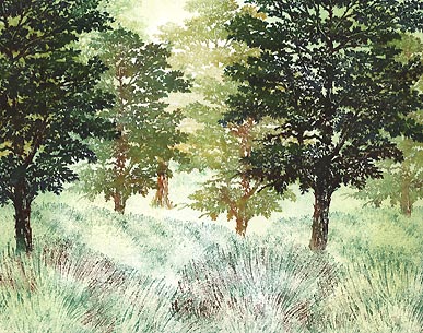
Tonal Applicator 084E: used in Ranger Industries (R.I.) Sea Shells "Conch Shell". I left middle of the page (grassy area) lighter than the surrounding area where the light would be falling. Also the top of the page where there is a break in the trees, ink was left out for the most part. This area is where the light will be entering the scene.
Colorbox Stylus Tool: used in (R.I.) Sea Shells "Starfish Green". Two areas of light are starting to define themselves through the usage of tone around them. In other words, I'm darkening the card around those two areas --one towards the top of the scene in between the trees, and the other on the ground-- and by doing so, these lighter areas seem even lighter by contrast.
Colorbox Stylus Tool: used in Marvy #14 Turquoise. The dark areas get darker and the light areas seem, yet, even lighter.
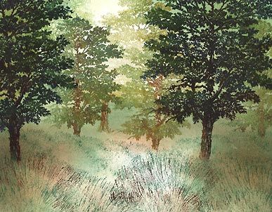
Colorbox Stylus Tool: used in Marvy #6 Brown. This was used somewhat sparingly. I didn't want this color to be everywhere as I wanted variation on the grassy floor.
Colorbox Stylus Tool: used in Marvy #72 Pine Green. Here I think we've arrived at a tone dark enough for what we're going after. I planned to try for a glowing light amongst the trees so I don't want to make the scene so dark that a misty cloud would stand out to starkly.
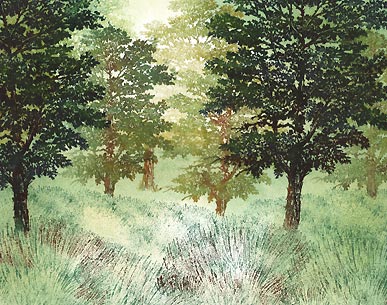
Foliage 035A: Colors blended directly on stamp with Marvy Pens: #72 Pine Green, #18 Dark Brown. Several impressions were made of this image because I wanted more variation to the texture in the grass. All impressions were made after I wiped off most of the ink off the bottom of the stamp image. I wanted the foliage to disappear into the grass.
Foliage lg 036B: Colors blended directly on stamp with Marvy Pens: #72 Pine Green, #18 Dark Brown. Several impressions were made on the bottom of the scene to represent closer forms to the viewer. These dark images also serve as contrast against the lighter meadow and sky.
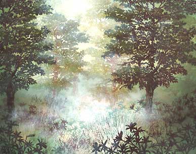
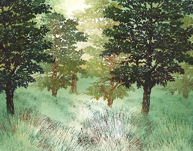
The mist/fog effect was added using Colorbox "Frost White" and Brilliance "Moonlight White" pigment ink pads applied in a dry dabbing Q-Tip technique. Very thin layers were built up one layer at a time. I start dabbing ink in the lightest areas and work out from there. The reason being is that as I dab color off in those light areas, the Q-Tip becomes drier (of ink) and thus I move out into the darker areas of the card --I don't want a think blob of white ink in a dark area.
It's somewhat hard to explain where to put this "fog/mist" in a scene but, basically, the thought is a layer of fog along the grassy floor and a veil of illuminated mist pouring through the trees. Kind of like being in a grove of trees where you see beams of light shooting through the openings. But in this case, the beams of light are being broken up by the thick layer of fog.
Add sparkle and highlights to your scene with Milky Gel Rollers. In this case, pastel green, yellow, and white were used. All of these colors related to the color scheme used with the dye based inks. These highlights bring an added shimmer to the wet grass as well as highlighting in the tress --limbs, leaves and trunk alike. It's the final touch to the depiction of light.