Iridescent Lake
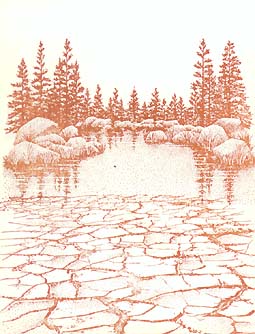
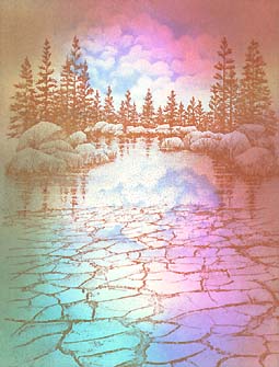
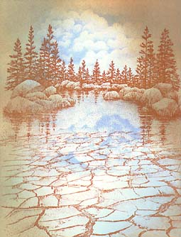
Lakeside Cove Lg.-049G and Cracked Earth Lg.-181G are positioned. Colour: Ranger Industries Archival Inks Sepia.
Note: I've tried this combination before, and I liked the results. The idea is to have a texture below what will be a water-filled crystal clear lake.
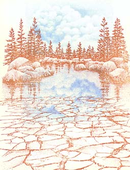
Cloud Cumulus -018E is positioned above the treeline and upside down below the rocks to act as a reflection.
Colour: Marvy Matchable Salvia Blue #60.
Note: I like raised dye-based pads for many of the stamps in the Stampscapes® line because of the even application of ink across the surface of the stamp with minimal puddling in the areas of tight detail.
Tone is added using the The Tonal Applicator-084E around the Clouds --being careful not to stamp out all of the cloud design. You want to work some of the color into the clouds, however, for blending purposes. Colour: Ranger Industries Sea Shells Ocean Aqua.
Note: What I always stress in my workshops is to begin the color application process --in this technique-- with the lightest colors they can find within the color scheme they wish to achieve. The first reason is because it makes the color blending as simple as possible. The second reason is because, quite often, the lightest colors give the darker colors --still to come-- something to "sit on" (a foundation). Dye-based colors are transparent so the undercolors will always have an effect on anything that's laid on top of them (eg. Yellow under blue will result in a greenish appearance. Light blue under a different blue will most likely result in a richer blue than if either were used alone).
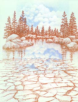
Tone is added over the first coat of blue (Ocean Aqua). Colour: Marvy Salvia Blue #60.
Note: Salvia Blue isn't much darker than Ocean Aqua. This is key for blending ease. For the first coating of ink, Ocean Aqua wasn't much darker than the white of the page. The same is so for each progressively darker color to come. I can't stress enough how much this process is simplified by taking each step a very small one. It makes the blending of color easy, and in the end, makes the cards so much richer by the building of tone as opposed to rushing into the darker values. Lay your colors out in front of you before blending, and your eye will tell you if it's going to be a smooth transition from color to color. In other words, try not to jump from one color to a color that's much darker in one step --if you can avoid it.
A third tone is added. Colour: Ranger Industries Archival Inks Sepia.
Note: Sepia over the two blues might sound like a strange progression, but I've found it to be an interesting combination in the past. It's a warm color over cool colors. Many times this type of transition will fail or will muddy up the scene, but I think what makes this work is the colors are all about the same value -relative lightness/darkness-- in the light range.
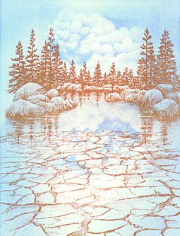
Fourth color is added in the right side of the composition (sky and water). Colour: Marvy Bubble Gum Pink #67.
Note: the composition was in bad need of brightness. Something to make the scene "pop" in the
form of a bright pink. It's bright, but it's still very light. There are bright colors that are
dark, but I wanted something that was close to the two blues and sepia in value. I only added it
to the right side of the composition because I wanted to maintain some pure blue areas in other areas of the card. If I stamped pink over or under them, it would read as some form of violet.
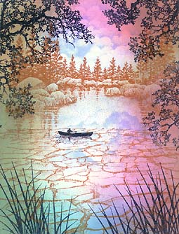
The fifth and final color of the blending process was added to the lower left-hand side of the composition.
Colour: Ranger Industries Sea Brights Pool.
Note: I wanted a brighter and darker area in the water so this blue seemed to fit the fill.
It was darker than the first three colors underneath it but not by much. I say three colors
because the area that it was used in didn't have that Bubble Gum Pink there.
Oak Branch-203G , Reeds Lg.-068D, and Solo Canoeist-159A have been added. Colour: Marvy Black #1.
Foreground and midground have been added. The Oak Branch and Reeds Lg. contain the scene from above and below and direct the viewer's eye to the Canoeist and off into the horizon. These objects also extend the depth of the scene by putting something directly in front of the viewer's eye and something in mid-distance within the card --the canoeist. These objects do not have to be stamped in black, but I would definitely recommend a color as dark or darker than the objects that have already been stamped including the colors applied with the Tonal Applicator. The reason is that I don't want the foreground objects to appear as though they're translucent windows to the background shapes.
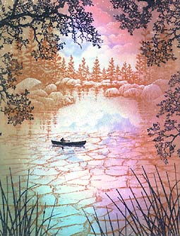
White dots are applied to scene using a Pentel Milky Gel Roller. Colour: White.
Note: The tool I love to finish my scenes off with is a white pen, and now with the
easy to use Gel Rollers I can do this in multiple colors if I wish. In this case, I
just used white because the scene is fairly light, and I didn't want the dots to read as dark dots.
Here the dots are used to represent highlights on the tops of billowing clouds and rocks with sparkles on the lake's surface.
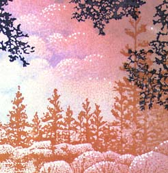
Detailed enlargement: I tend to use the dots on the top surfaces of things or, otherwise, facing the light source. As the forms turn in space --become the sides of the objects-- the dots (highlights) become sparse. This can be seen in both the rocks and the clouds here.