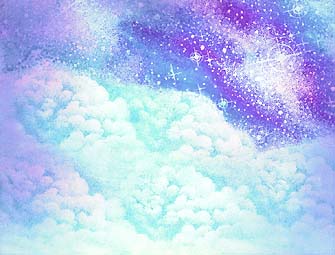
Clouds & Milky Way
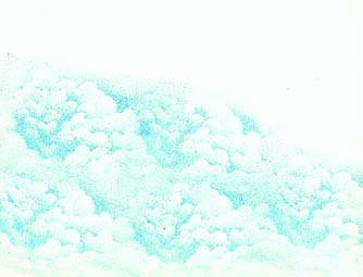
Five impressions of Cloud (Cumulus)-018E were stamped in Ranger Industries Sea Brights Pool blue. Note: When using this cloud stamp it's best used on either glossy paper or, if matte, a paper with a nice smooth surface. Overlap each impression with the next and change the angle slightly to avoid a brick-layered look.
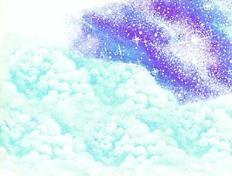
Clouds were masked and Milky Way Lg.-059G was stamped using colors of Pool,
Marvy Manganese Blue #36,
Marvy Pink #9,
Marvy Periwinkle #99.
Note: 059G is largely a solid mass. To change and vary the depth of the image you can use color mixed on the surface of the stamp. Streaks of Pink were colored on the Milky Way Lg. then the Blue and Periwinkle were blended into the Pink before the impression was made. On masking, only a ripped paper towel --torn to roughly contour the edge of the cloud line-- was used to give a softer edge.
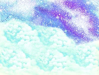
Milky Way Lg.-059G was stamped one more time to fill in the rest of the sky. Colour: Pool
The
Tonal Applicator-084E was used to start blending in the first color --
Marvy Salvia Blue #60. Note: Salvia Blue is a nice light blue, and I believe, the lightest blue that has been released in their Marvy Matchable line. It's a good blue to start with as it's very light --not too much darker than the white of the paper.
The Tonal Applicator was used to stamp the next color --Marvy Bubble Gum Pink #67. Note: I wanted some variations of violet hues in this scene. I felt that the lightest values of it would come from the blending of the lightest blues and pink that I had --as opposed to going straight into a violet color/pad. This way, more variation would happen --e.g. Where there is more overlapping of the two colors, there will be more violet to the eye. Where there's less overlapping, the colors will read as more of their original color (light blue or light pink).
The Tonal Applicator was used to bring in the same Ranger Industries Sea Brights Pool color that was used to stamp out the cloud impressions. Note: Instead of making the sky the blue of the actual Pool color, it was used to subdue the pink from the last color layering. The pink was looking too "hot" to me so I toned it down with this blue. As you can see it also added another value to the scene by making things a little darker --and by doing so, made the clouds appear lighter by contrast.

The Tonal Applicator was used to bring in Marvy Light Blue #10. Note: I wanted to extend the value range --light to dark-- one more step, and I like the brightness of this blue.
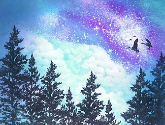
Five impressions of Spruce Lg.-078F and Geese In Flight-039A was stamped in Marvy Black #1. Note: I've staggered the height of the tree impressions to keep it from looking too picket fence-like.
Pentel Milky Gel Rollers in White, Pink, and Blue were used to add additional stars in the sky area. Note: The Tonal Applicator process took away some of the Milky Way texture and detail, but they can be brought back into the scene by hand with these opaque pens. Since this scene was in this color scheme, I used the same color choices in the Gel Rollers.