Lake & Moon
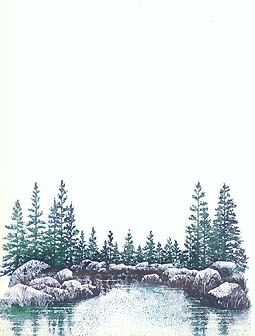
Lakeside Cove Lg.-049G was stamped in Marvy Bottle Green #25,
Dark Brown #18,
Pine Green #72, and
Manganese Blue #36. Note: The Brush
Markers were used instead of the Marvy Matchables. I usually just stamp this out in black, but I wanted a change. No particular reason.
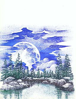
Cloud w/Rising Moon Lg.-198G was stamped in Marvy Blue #3 and Manganese Blue #36. Note: No need to mask the trees out since they're darker than the impression of the moon/clouds.
Cloud (Cumulus) Lg.-019G was stamped in the same two blues as the previous stamp. Note: Overlap the previous stamp for the best results. That way the two stamps will merge in a more seamless fashion.
The
Tonal Applicator-084E was used to start the blending process in Marvy Salvia Blue #60. Note: This is a good color to start with in the color scheme for this scene because it's such a light value of blue. Some of the clouds have been left the white of the page to suggest reflecting light. The moon has, for the most part, also been left the white of the page to become the light source. Some light tapping with the Tonal Applicator (T.A.) was used after the stamp was very dry --on the moon-- to keep the moon from looking too light.
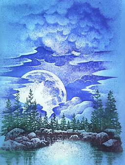
The T.A. was used in Manganese Blue #36. Note: A great light/bright blue to use as one of your light colors. Marvy currently only sells this color in pen form only, which isn't so bad since, in the early colors with the T.A., you usually want a good foundation (coverage) of the hue. Pens tend to put on a very wet application of ink on the T.A. since it gets into the grooves of the stamp.
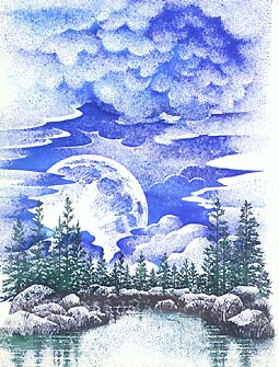
The T.A. was used in Marvy Light Blue #10. Note: They call it light blue, but it's more of a middle-tone blue compared to some of their other blues. A very bright color. It's good for your midtoned blues.
The T.A. was used in Marvy Blue #3. Note: Getting pretty dark here. Be careful not to bring your color --from the outside in-- on your card too fast. It's a darker color to begin with so it's going to take a lot more tappings to get it to be as light as your first couple colors (Salvia Blue, Manganese Blue).
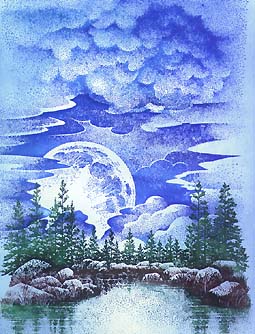
The T.A. was used in Marvy Black #1. Note: To really frame off the picture and to give the maximum contrast to this scene, black has been added. Again, be careful not to bring it in too quickly. You might even tap off your T.A. a couple times before using it on your card. This isn't the time to get a big "pear" shape in the middle of your moon.
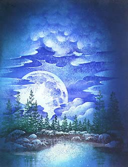
Some Colorbox White pigment ink was used on the clouds and throughout the scene in little areas. A Milky Gel roller pen White was used for details. Note: In addition to the Milky Gel Roller, I've applied some white pigment ink from a Colorbox pad to the scene for some more subtle, softer highlights. Mostly in the clouds but also over the lake surface, the white paint was applied with the use of a cotton swab. By dabbing, and in some areas, streaking/wiping the paint you can bring some nice effects to the card. On some of the clouds --closest to the moon-- and on the side facing the moon, I've dabbed on some white paint to "turn" the object (cloud) in space. It gives it a rounded look by the use of light and shade. Over the water, it can look like fog or mist. The white pigment ink dries very quickly when applied in this fashion being that the quantity of ink is so thin. Also, since it's a different compound than the dye-based inks, it won't really smear what you've done. Another great thing is that you can just wipe off what you don't want after it dries. It comes off very easily. So, if you want it to be more permanent, spray it with a clear acrylic spray. If some of the white disappears then just do the same with more white right over the top of the spray seal and spray again. The marks are pretty subtle, but that's in the spirit of the whole technique anyway. Stretch out the process and make it easier to do with the final result being a very rich, deep card.