The Stampscapes® 101: 9-Step, Lesson I, Frames 1-9
Early Morning at the Brook Falls
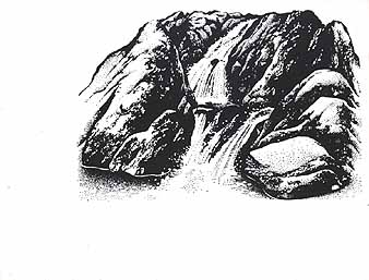
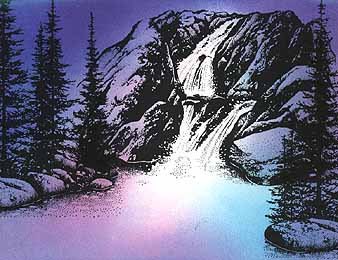
Brook Falls-184G was positioned. Colour: Marvy Black #1.
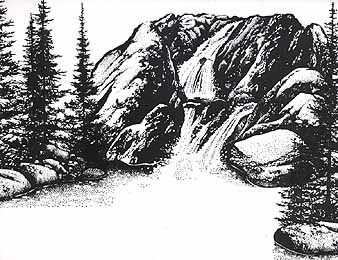
To fill in the space to the left and right of the "Brook Falls-184G", Pines & Rocks-195G was stamped twice. Colour: Marvy Black #1. Note: The height of the "Pines & Rocks" was staggered with each impression to give variation in image depth. The partial impression to the right seems to be closer to the viewer due to it's lower placement on the scene.
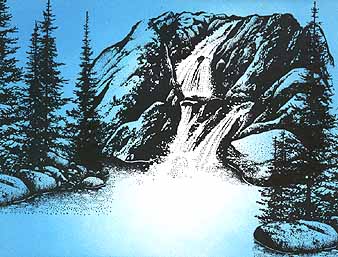
To give the illusion of light in the scene, the Tonal Applicator-084E was used to stamp in the color/tone in the scene. Colour: Marvy Aqua Marine #74. Note: I wanted the running water to stand out in the scene as if it was glowing. Therefore I didn't glaze any color over the falls and left the area around the base of the falls the white of the paper. The Aqua Marine is a very light and bright color which makes a nice base coat and foundation for the other colors to come.
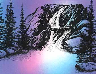
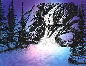
Pink was added to start the glazing of colors with the "Tonal Applicator". Colour: Marvy Rose Marie #59. Note: All areas were glazed in with the pink. Some of the Aqua Marine was left as is to add to the variation of tone throughout the scene. Also, some areas of the card --around the base of the waterfall-- the Rose Marie pink color was glazed over some of the remaining white area of the card. Therefore that area will read as straight -Rose Marie.
To add more contrast and depth to the scene a darker color was glazed into the upper area of the card with the "Tonal Applicator". Colour: Marvy Pale Violet #31.
Water Pattern-092E was stamped in the "pool" area of the card. Colour: Marvy Salvia Blue #60. Note: The "Water Pattern" was stamped in a light tone. I didn't want anything too harsh so I just very sparsely tapped in a little tone from the
darker region of the pool into the lighter (base of the waterfall) area. By the time I stamped the "Pattern" out a couple times it became dry on the stamp and thus "lighter" in impressions --perfect "wetness (or rather dryness)" for the lighter area of the scene. Subtle water textures read well as a surface texture rather than stamping the "Water Pattern" too dark and harshly.
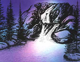
As we did in step 5 with the "Tonal Applicator" to add depth to the scene, more texture was stamped in a darker color in the pool --in the darker regions-- with the "Water Pattern". Colour: Marvy Pink #9.
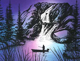
On the bottom of the card, Reeds Lg.-068D was stamped, reinked and repeated across the length. Fisherman in Boat-187B was stamped in the pool. Colour: Marvy Black #1. Note: The angle and height of the "Reeds lg" was changed slightly with each impression to give the blades a more "random" look. I didn't want a "picket fence" look aross the card --not that that would be bad.
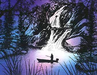
Portions of the Oak Branch-203G was used in the top and side
portions of the card. Marvy Black #1. Note: The "Branch" provided a nice "cap" for the composition and added texture, depth, value/contrast to the scene. Between the reeds and branches the scene became more intimate and "alive" and perfectly framed off the "Fisherman in Boat".