The Stampscapes® 101: 9-Step, Lesson III, Frames 1-9
Crescent Over the Cove
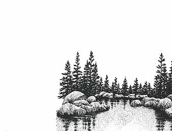
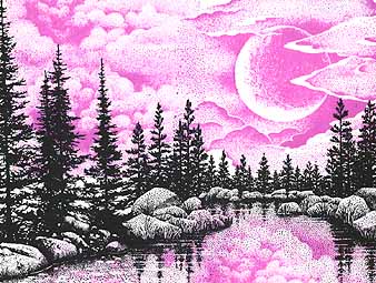
Lakeside Cove Lg.-049G was positioned. Colour: Marvy Black #1.
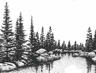
To fill in the space to the left of the "Lakeside Cove Lg.", Pines & Rocks-195G was stamped. Colour: Marvy Black #1. Note: The "Lakeside Cove Lg." could have been reinked and stamped to the left of the initial image but I wanted this scene to have a little more depth. With the "Pines and Rocks" image, the pine trees are larger giving the illusion of closer proximity to the viewer.
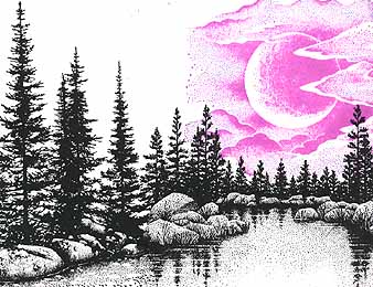
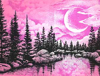
Cloud w/Crescent Moon Lg.-202G was stamped in the sky. Colour: Marvy Pale Violet #31. Note: Quite often I like to stamp my sky figures --clouds, moons, suns, etc.-- in a color that's in whatever "color scheme" I'm planning to be working in on a given scene. Masking wasn't required for this impression. Since we're working with transparent colors, stamping the violet clouds over the black trees didn't result in an apparent "covering up" of the trees. The black is simply much darker than the purple so that's what we're going to see.
Cloud Cumulus-018E was stamped to the left side of the "Cloud w/Crescent Moon Lg."to fill in the blank space with more billowing cloud texture. Colour: Marvy Pale Violet #31. Note: The two sky figure stamps were slightly overlapped for blending
purposes. In other words, you don't want to perfectly line up the two edges. If this were done the images would take on more of a "masonry" look where the edges were very apparent.
More "Cloud Cumulus" was used to fill in the remaing space in the sky and also stamped in the water to give the impression of a reflective lake surface. Colour: Marvy Pale Violet #31.
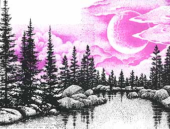
To give the impression of the "Cloud w/Crescent Moon Lg." as a light source, we have to make some areas around the moon darker. The Tonal Applicator-084E was used to blend in colour in the sky, trees, rocks, and water. Colour: Marvy Rose Marie #59.
Note: To make the Crescent Moon appear as the scene's light source it's important to not color over the actual moon with such tone. I've left the moon the white of the paper in this case. You can get some color over the moon to give it a little hue, but you might want to be careful not to go overboard with your "Tonal Applicating" or sponging. Same thing with the
lake's surface. I wanted to give the impression of reflective light so right below the moon, I've left a little area of the lake's surface the white of the card.
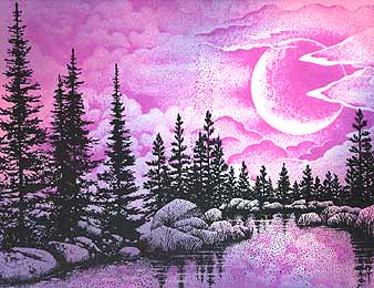
To blend and glaze more color over my scene I've added a light blue with the "Tonal Applicator." Colour: Marvy Salvia Blue #60.
Note: I wanted a "purple-like" scene in this picture. I could have used a light purple pad to blend in my tones but I've chosen to get variation of purple-like hues by mixing a very light Salvia Blue with my light Rose Marie. When I say mix, I'm refering more to an "optical mix" than a "physical mixing" of colors. Since the colors are transparent, that I'm using, the colors that are being layered upon each other will always "read" no matter how much more color you layer over them --for the most part. For example if you take a plastic transparency of pink and a plastic transparency of blue and put them together and hold them up to the light, you'll see a purple-like color (I think). This is the principle that's working here. I like the variation that happens when we mix to form other colors. Where a lot of my Salvia Blue overlaps the Rose Marie, a fairly distinct Purple happens. Where a high concentration of blue overlaps a light pink, then the color reads more heavily in the BLUE-purple spectrum. Same for the pink- more pink and very little blue will read more as a pink heavy purple.
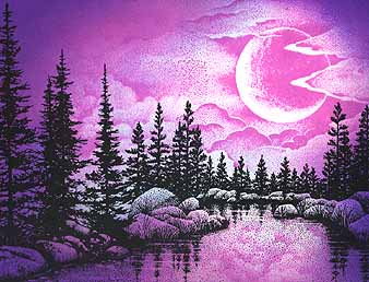
To increase the contrast even more and to "pop" my moon out a darker purple was layered in the corners with the "Tonal Applicator". Colour: Marvy Violet #8. Note: I wanted a transition of light-to-dark to happen from the Moon to the
outsides of the card. How this applies to the application of tone is that when I've arrived at this #8 violet and started "toning" my card, I didn't take/blend in the color as far towards the moon as I went with the two previous (lighter) colors.
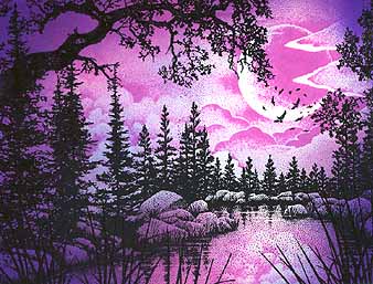
Portions of the Oak Branch-203G was used in the top and side portions of the card. On the bottom of the card, Reeds Lg.-068D was stamped, reinked and repeated across the length. Flock-112A was stamped over the bottom portion of the moon. Colour: Marvy Black #1. Note: The angle and height of the "Reeds Lg" was changed slightly with each impression to give the blades a more "random" look. I didn't want a "picket fence" look aross the card --not that that would be bad.
Between the dark Oak Brances and Reeds Lg. in the foreground we get a heightened sense of depth. Suddenly we have something very close to us. The dark limbs also increase the value range of the scene --the dark black limbs contrast against the light sky as the reeds against the lake's reflective surface. The texture range is extended in the scene wit the the
hard craggy limbs set against the soft cloud formation. The "Flock" gives the viewer a focal point and the circling nature of their movent carries our eye up into the night sky as the birds size varies.
Return to Stampscapes® 101 9-Step Progression Lesson Outline
Go to the Stampscapes® 101 3-Step Progression Lesson Outline
Go back to the STAMPSCAPES® home page