The Stampscapes® 101: 9-Step, Lesson VIII, Frames 1-9
Lakeside Rays
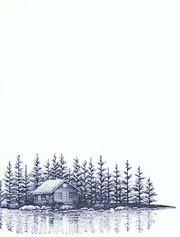
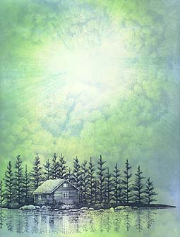
Lakeside Cabin 147F was stamped in Marvy Uchida #1 "Black".
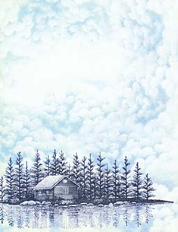
Cloud (Cumulus) 018E was multiple times in Marvy Uchida #60 "Salvia Blue". Note: The cloud was stacked and overlapped with each additional impression of it. On the sides and top of the scene the cloud was turned so that the top of it always pointed in toward the center of the card. Also, before each impression, the top of the cloud was blotted so that the top of the cloud would be very faint when stamped. The result is that, where there is an opening in the clouds, it appears as if it is the source of light.

The Tonal Applicator 084E was used in "Salvia Blue". Note: Using the T.A. in a tapping motion, from the outside in, the edges of the card become the darkest areas. It's generally best to start from the edges when you ink up the T.A. and eventually "tap" your way "in" to the scene. Thus avoiding the "Pear shapes all in my card!" effect. Condense your tapping. Use a lot of ink. With each impression your T.A. will become dryer and thus lighter with each impression. By the time I get to the center area of the card --in this case the light source-- the T.A. is very dry and light. With this effect, we achieve a nice transition from dark (outside of the card) to light (inside). The cabin remains largely untouched (I run a very dry T.A. over it for hints of color) as I want the roof to stay light as if it's being illuminated by the light source.
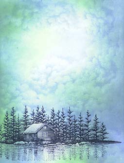
The T.A. was used in Marvy Uchida #60 "Pale Green". Note: This green was used in the same motion as the blue. The only difference is that I left some areas of the card alone so I could keep some of the pure Salvia Blue. This green isn't much, if any, darker than the blue so it was a good choice as the second color for blending. It's always better not to jump to a color that's much darker than the one you just used. The blending process is easier and the end result will be much richer in color depth.
The T.A. was used in Ranger Industries Sea Shells "Conch Shell". Note: I wanted to bring in a little more intensity and warmth into the scene so I used this very light yellow green color. It looks pretty bad as is stands at this point but there's still a few layers to go. This color is just going to be an under color as the two colors previous so I'm not worried about it. It will add to the depth in the end.
The Tonal Applicator (Rays) 117E was used in Ranger Industries Sea Brights "Pool". Note: The question of how to use the different Tonal Applicators --Rays & Flames-- are definitely in the top ten questions of what I'm asked in classes and demonstrations. The answer is that I tend to use it as an image as opposed to the standard Tonal Applicator 084E (which is used as a tool). I want the rays to stand out. That being said, I tend to use them in the third or fourth color in the "toning" process. It isn't necessarily that much of a formula but you basically want it to stand out enough to see --or darker. If it was done in one of the first three colors it probably wouldn't show up. But remember, if it's too light you can always stamp darker impressions. If it's too dark, you can't make it lighter. Anyway, 117E was stamped with the tip pointing -in- toward all around the opening in the clouds. I wiped away the ink on the tip of the 117E to avoid the curved area of the stamp ending up in that light area o f the ope
ning (of the clouds).
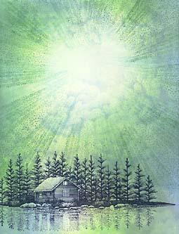
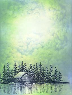
The Tonal Applicator (Rays) 117E was stamped in Marvy Uchida #4 "Green". Note: I wanted to get some more definitive rays into the scene. I didn't use it as many times directly around the opening of the clouds as I did with the "Pool" color but more towards the outside of the card --where the card was darker from the Tonal Applicator 084E process.
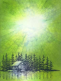
The T.A. 084E was used in Marvy Uchida #11 "Lt. Green". Note: The scene was looking a little anemic to me so I added a more vibrant color to intensify the otherwise very soft color scheme. I also wanted to blend the rays into the scene with a couple more colors. The next color being...
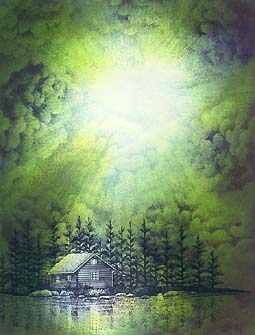
The T.A. was used in Ranger Industries Adirondack "Denim" as was the additional Cloud (Cumulus) 018E impressions. Note: This is where the scene came together. One additional step in value seemed to unify the scene and bring it drama. Notice how, in some areas of the sky, there are still areas where "light" reaches the edge of the card. In these areas I didn't use any of the denim color. In the last scene, most of the initial clouds were buried in the background under layers of other equally or darker colors. I wanted more distinct clouds so I used the stamp once again but more to the outside areas of the card. This added to the value range and gave the scene much needed "containment" --it framed the composition. I don't think the first cloud images were a lost cause because in the center of the card and under the darker colors there still remain traces of them adding to the depth of the scene.
Return to Stampscapes® 101 9-Step Progression Lesson Outline
Go to the Stampscapes® 101 3-Step Progression Lesson Outline
Go back to the STAMPSCAPES® home page