Milky Way Large
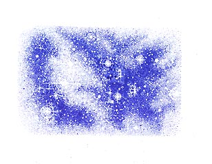
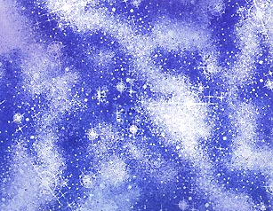
The Milky Way stamp has been stamped out in a dark blue. The question now is, "How do I get rid of this solid shape and have it blend in with the surrounding blank area in a seamless fashion?"
With the second impression of the M.W. I've overlapped the first impression slightly to avoid a white/blank space in between the impressions. I've also stamped it off center from the first one while changing the angle of the impression slightly. In this case, I've also loosely lined up the band of stars that runs in a diagonal across the image.
The third impression was stamped off center from the first two, again, to avoid looking too symmetrical or stacked. I've also lined up the top of that diagonal band of stars with the bottom of the first impression to create the look of one continuous Milky Way band.
In the fourth impression I've filled in most of the left side of the blank area by stamping the M.W. with a diagonal position. The key to all of these impressions is to slightly overlap the existing impressions to avoid straight line gaps in between the images.

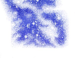
The top right area has been filled in here with another impression.
The Tonal Applicator 084E was used in a light blue color. I've left some of the stars the white of the paper so that I'll have some sparkle to some of the areas. Note: These days, I'm primarily using a Stylus Tool to do a similar color application to the cards.
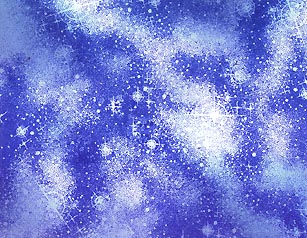
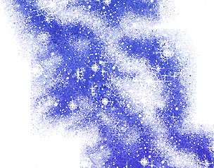
The T.A. 084E was used in a slightly darker blue than the first. The darker you take some of your areas, the brighter the areas left alone will seem (by contrast). In this case the stars will seem brighter.

The T.A. was used in yet another value of blue. Again, I want to be careful not to stamp out some areas where I want my stars to shine bright.
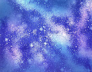
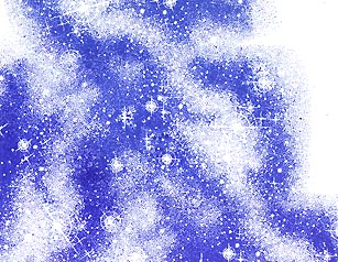
In this step I've added some Marvy "Bubble Gum Pink" which is a very light pink. I wanted to show some variation within the scene by adding a new hue. Where pink overlaps blue, a violet hue will develop as dye based colors are transparent.
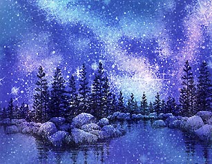
Here I've stamped the Lakeside Cove Lg. 049G twice (slightly overlapping the first impression -to avoid a white space in between the images). I've also added some stars to the scene --in the areas that got darkened with the Tonal Applicator-- using Milky Gel Rollers in white and light blue. I could use this image at this point in the card (the end) because this cove is primarily solid silhouette shape. If it was something where there was an area that I would like to remain light, I would have stamped the image first, masked it off, and then stamped the Milky Way over it.