Tonal Applicator
Have you tried this stamp and achieved a look such as this? When using the Tonal Applicator 084E to fill-in your empty space with tone, you might be getting pear-shaped, distinct impressions like those in the image above. Follow the instructions below to improve your Tonal Applicator technique:
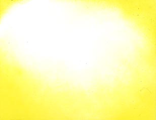
These scans are roughly actual size. In the upper left hand corner there is a small application of yellow. This is the amount of area on your card that you want to be starting the toning process on. It's just about 1/4 inch on the card when I start "tapping" on color. After a few taps I progressively start moving my way into the card keeping with the same tapping movement. On the upper right I've moved in towards the center of the card and on the bottom I've moved in almost to the center of the card. The center is lighter than the sides because, with each tap of the Tonal Applicator, it becomes drier and thus lighter. Note: each time the T.A. becomes completely dry you can re-ink the stamp but always start from the outer edges again. Also, it's not a matter of using the T.A. with the pointed end moving towards the center of your card, or the back --It's the SIDE pointed towards the center of your card. The side is naturally rounded and that's how you'll end up with this rounded shape. When it's used with the pointed end --pointing in-- it usually results in a look like the previous link.
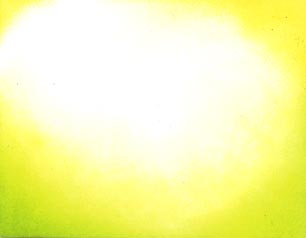
The next color that was applied was a color that was very close in value --light to dark-- to the first color. It's important to start the process with the lightest color of whatever color scheme that you're going after. In this color scheme we started with yellow, which was the closest to the white of the paper. In this scene I wanted a color that was close to the yellow. Here I've used yellow-green. The process of the Tonal Applicator is exactly the same as the first scan --start from the outside and work -in. I've left the top of the card plain yellow so you can see the difference.
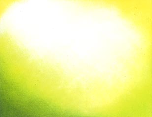
This being said, if you were going for a dark moonlit scene that is going to be dark blue it would be a good idea to put a few shades of light blues under your, eventually, darker blue.
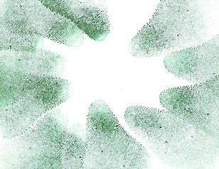
In the left hand corner I've used a straight green. Again, working the Tonal Applicator from the outside-in I've applied tone. Here it becomes very important to WORK THE TONE-IN AT A SLOWER RATE. In other words, tap the T.A. on the outer edge longer before you move-in. The color you're using is darker to begin with so that 10th tap is going to be a lot darker than the 10th tap with the yellow. You don't want to have that pear shape in the middle of your scene now.
Note: I know this isn't the greatest description of the method of the Tonal Applicator but all of the major points have been stated. One day we'll have some streaming video where I can actually show this tapping motion on the web and the angles.
The biggest problems are run into when:
1) A color that is too dark is used to start the process. Start with light colors and get full saturations with these colors. The light colors won't leave such contrasting heavy impressions and will provide a foundation for the darker colors to come.
2) Making a jump from one color to the next that is too dark in comparison to the previous color. When working from light to dark, try not to make the jump to a color that is so much darker just as the first color wasn't so much darker than the white of the paper.
3) Not enough impressions/tapping are/is used. If I tap the Tonal Ap. three times on a piece of paper it's going to look like three pears. What you want to do is to make so many tappings that the shape disappears and only tone remains. Using an almost vibrating motion will leave a smoother transition and application of color.
Video 54. The Tonal Applicator (stamp 084E) Tutorial.
Watch Diane Long's great April 2010 Tonal Applicator video lesson