"Shoreline" 1997. Danielle Coté, Quebec, Canada.
Medium: Inks, colored pencil. Images: some Stampscapes. Other images- companies unknown.
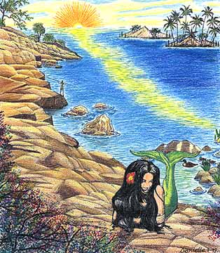
Notes: Whew. Yes, quite a scene huh? I like the scene for numerous reasons but mostly for the obvious one; It's just cool. This is a scene that would be a great example of perspective. My eye started at the mermaid in the foreground and followed the shoreline right back to the setting sun in the distance. The diagonal placement of the staggered islands also point back to the sun. There's a nice "motion" to this scene too. I like the "swooping" curve of the shoreline --enhanced even further by the curving cluster of foreground bushes-- that starts from one diagonal to it's opposite. Then the warm shimmering reflection of the sun, on the ocean surface, takes me back to the front of the card. The usage of the Ledge with the Rocky Cliff -Left is one of the best I've seen (if it's not the first time I've seen them used together). This is also another example of what I mean when I say Stampscapes isn't limited to the way that I use them (glossy paper with layered transparent dye based colors, tonal applicator, etc). There's tremendous depth and richness in this scene using a totally different medium. Quite a composition.