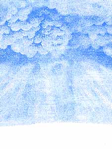
First, position and stamp the Cloud Cumulus Lg and the Aurora Borealis --both twice & overlapping slightly. Be careful not to use too much ink. I used new pens on these cards so I let the ink's moisture dissipate for about 45 seconds after coloring the stamp before applying it to my glossy paper. Also, I dabbed a little of the ink off the perimeter of the stamps to ease transitions of one impression into the next when overlapping.
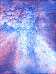
Second, use the Tonal Applicator to blend the images even further through value and hue. Directing the light through the use of tone, I stamped around the rays of light and left an area in the cloud white--so as to project a feeling of a light source beyond the clouds. Be careful not to stamp out everything with the T.A. if you want to retain your light source. Pink was used to add variety and richness to the color scheme. Where it overlapped the light blue, a violet hue formed.
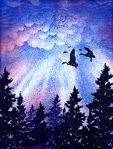
Third, the Spruce lg was repeated across the scene in a dark tone--inking the stamp w/each impression. Then a smaller Spruce was added using slightly lighter tones to add visual depth. Geese in Flight lg was added for a focal point. Then, last but not least, an extra fine Opaque White paint pen added the final touches. ©KJN 1994