4.25" x 5.5" glossy card stock
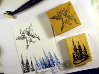
Pines & Rocks was stamped twice in black and two more times in a dark blue using dye based inks. The blue toned pines will represent distance. Cherubs (Ornamentum) stamped in black.
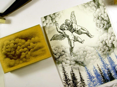
Cloud Cumulus was stamped in black about 6 times around the cherubs. Some impressions were second impressions off a single inking.
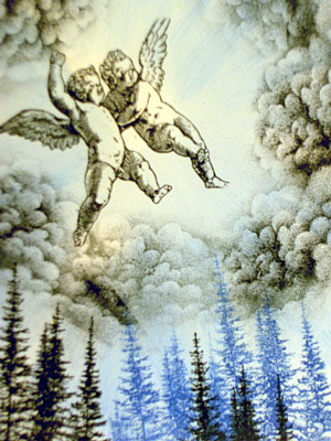
"Ocean Aqua" and Marvy #60 "Salvia Blue" were added with a Stylus Tool. I streaked these colors in from the perimeter of the card towards but not over the cherubs. I wanted the colors to be streaky. Note that some areas between the streaks were left the white of the paper. These areas will represent light beams.
A medium tone blue was streaked in the same manner as the previous two colors. Also, a very light value pink was added for variation from the blues.
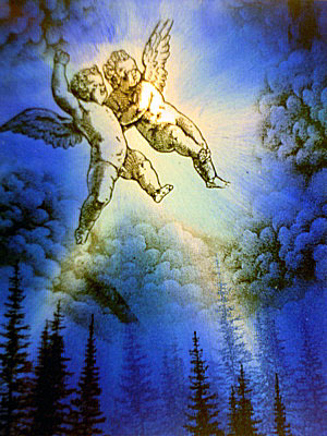
A dark blue was added in the same way.
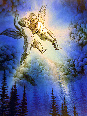
Black was added to the outside edges of the scene to frame and increase the contrast in the scene. The darker the edges the lighter the light rays will seem by contrast. I don't bring the darker colors in as far as the lighter ones usually. This practice creates the illustion that light is emanating from within the scene by having a lighter center and darker edges with a full transition of value in between.
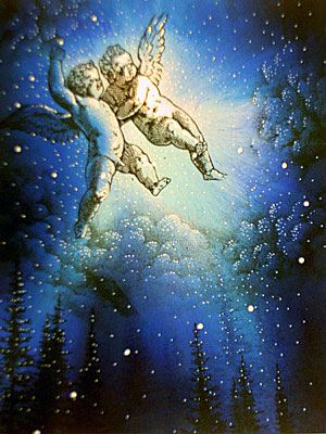
White dots were applied to the scene with a White Gel Pen. I've highligted the clouds and trees and put a serpentine line of larger dots rising and wrapping around the cherubs.
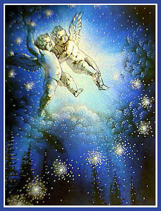
Using a cotton swab, white pigment ink has been lightly dabbed on to the larger dots giving them a "glow". Additional gel pen dots illuminated this glow idea by clustering little dots within the glowing spheres.