4.25" x 5.5" glossy card stock
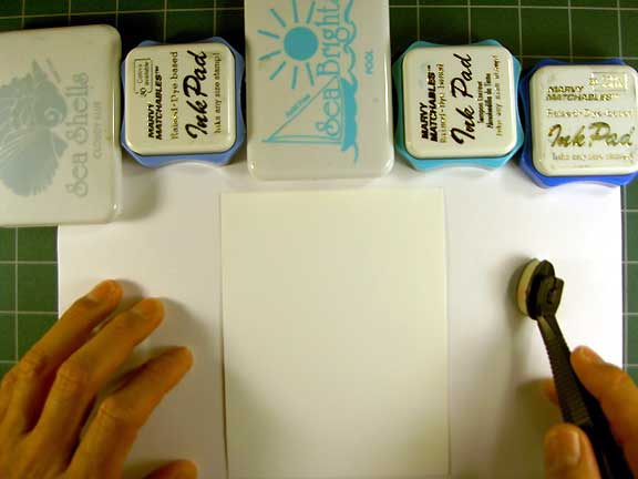
This process works best with glossy card stock and dye based inks. Here I've laid out a range of blue values in order from light to dark. I would highly recommend this step so you can actually see the range and when you start applying the inks to paper and you won't have to go look for the next color while in the process. The brand of ink doesn't matter but I would say that I like to use Ranger Industries Sea Shells (now renamed Adirondak Lights) as my first color. The reason being is that their inks seem to be a little thicker and more slippery. Perfect for this type of look and feel that we're going for. I use a Colorbox Stylus tool with a white foam tip as I like the feel of the wand (plastic handle) as it is very ergonomic and comfortable but one could use a piece of foam rubber or something like a makeup sponge to apply the color with.
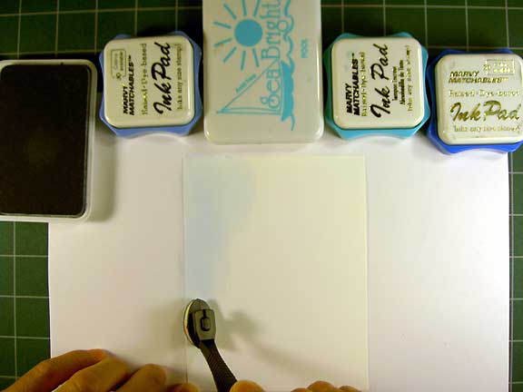
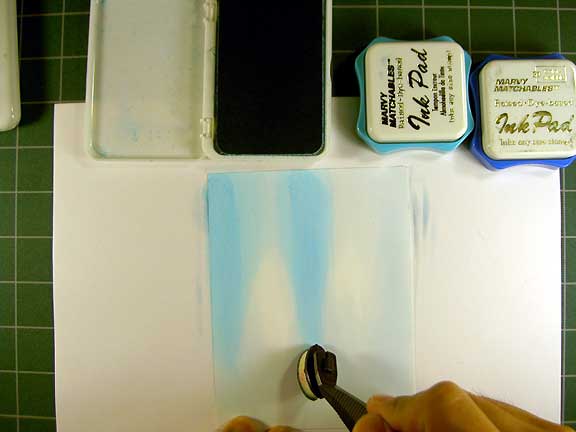
The first color being applied here is Sea Shells "Ocean Aqua". It's a shadow stamping (very light value) color. I'm going to apply a large amount of this color to the paper before moving to my next color. Notice here that I'm applying color to one area and achieving a full layer of that ink. You don't want to try and apply ink over the entire card all at once. Just work one area at a time which will result in smoother blends/streaks. My motion for applying ink is from the top of the card - downwards. It's the natural motion of the hand and I do this motion in a pendulum motion as opposed to a dragging streak that might end abruptly instead of a fading streak. Does this make sense?
I've gone with three distinct areas where I've "pulled down" the "Ocean Aqua". The areas left light will serve as my light source in the scene. Where you see the blue ink in this photo, there is a thick layer of ink. I'm not just coloring in this step but I'm getting the paper close to soaked with the ink so it will serve as a lubricant of sorts for the other blue values to come. The wetter this layer is, the easier other inks will slide on it.
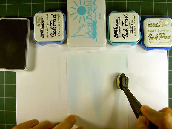
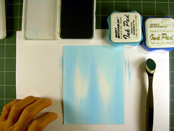
Remember where I was talking about the natural motion of the hand? Well to get the other side of the card, I've turned my card upside down so I can add the streaks on that side. For many, I've noticed a tendancy to try and keep the card one direction during the entire coloring or stamping process. I see the card as if it were on a lazy susan where I'm always turning it in the direction where color application or stamping is the most ergonomic or accessible. NOTE: you don't need an actual lazy susan.
The next color that I tried was a Marvy #60 Salivia Blue. It wasn't much darker than the Sea Shells or didn't go on dark enough over the damp ink enough to make a big enough difference so I switched to the Ranger Sea Brights "Pool" which was my next color in my blue pad value range. Where do you apply it? Basically, over the same place that the first color was applied but, for variation, you can leave some of the pure "Ocean Aqua".
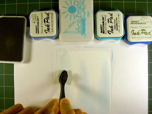
Completed "Pool" blue. Can you see the two tones of blue? It's subtle but that's what you want. It's easier to achieve a nice blend when you don't jump from one value to another that is a lot darker.
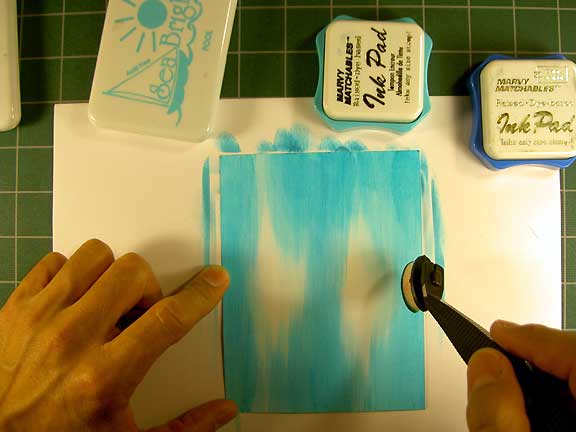
Marvy Caribbean Blue and Light Blue were applied here. In these medium value blues start using the colors a little more sparingly.
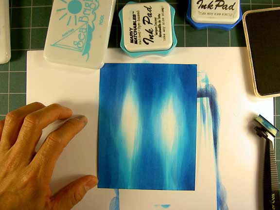
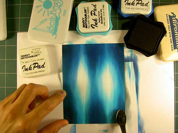
To push the value range even more, a Marvy Black was used. With the areas of ink wet from all of the blue tones the black won't transfer on to the paper as dark as it would if the paper were dry. The reason being is that the the pulp of the paper will be wet and applying wet ink into a wet piece of paper creates a situation where only partial transference of ink will take place. You'll be applying ink but some of it will be wiping off at the same time. This will make for smooth transitions.
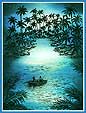
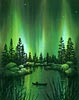
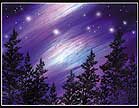
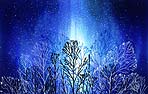
These are some examples using this technique.

Video Lesson