5.5" x 8.5" glossy card stock

A Ranger Industries Sea Shells (now renamed Adirondak Lights) Reinker Cloudy Blue was applied with a Colorbox Stylus tool as my first color. For a lesson on ink applications in this style, see the Stylus Tool/Color Streaks lesson. To expedite the color saturation process, I used the reinker instead of a pad but a pad would work just fine. With the reinker I just soaked the Stylus Tool tip directly with Cloudy Blue ink.
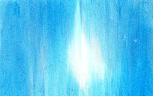
Marvy #10 "Light Blue" was applied to the scene using the same Stylus Tool. Note: It isn't necessary to clean the Stylus Tool tip between colors. The first Sea Shells color will help to blend this next color into the background. This goes for all of these incrementally darker tones in this scene/lesson. Retain some of the light center of the card but still apply a pretty complete coverage of this color. A more streaky application of color can be achieved by utilizing the Stylus Tool on an angle instead of the entire flat side of the oval pad. This will result in a thinner streak.
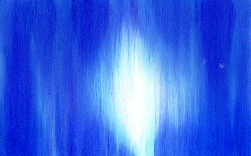
Marvy #3 "Blue" was applied to the scene using the same Stylus Tool. Apply some of the color in a heavier application in some streaks for a varied and richer surface.
Marvy #29 "Prussian Blue" was applied to the scene using the Stylus Tool.
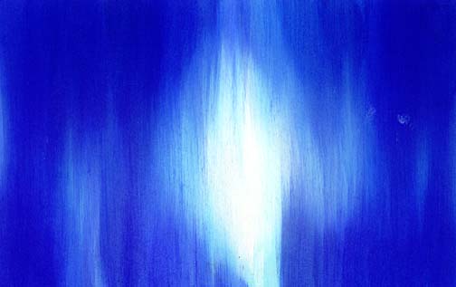
Marvy #1 "Black" was applied to the scene using the Stylus Tool. This color was used primarily in the four corners.
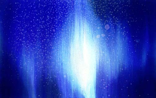
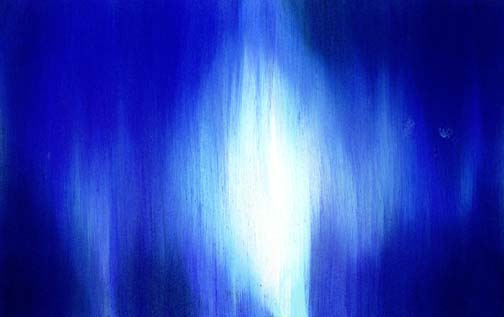
Okay, here's where it gets interesting. I sprayed regular water on to the scene with a common spray bottle set to fine spray. I wanted to push the texture of the scene by doing this. After spraying the card I allowed the beaded water on the surface to sit for about 5 minutes for the ink to "lift" from the card in almost a bleaching effect.
I didn't like so much contrast on some of this spray pattern so I reapplied the Marvy #10 "Light Blue" to some of the "bleached" dots. These spray dots became light blue but retained their pressence. I liked the spray pattern but I didn't want it to look like the card had chicken pox so this did the trick.

Curvy Branch 271G was stamped in the Marvy #10 "Light Blue". I wanted to have these branches fade in the distance a little. To do this, use a color from your value range that was used in a background. In this case I used a mid value blue. A lighter color would make the branch appear even farther away but I thought the background was too dark for a lighter value of blue to show up. Three impressions were made with the stamp and new ink was applied for each impression.

Prickly Branch and Curvy Branch 271G was stamped in white pigment ink. I used both a Brilliance "Moonlit White" and a Versa Magic "Cloud White" in the impressions. Using the two wasn't so much of a strategic approach. I had them both and wanted to see if there was a visable difference between the two. The difference was very subtle but both applied nice and opaque over the background. Did you notice the spray background seemed to change from the previous step? The card stock was still wet from the spray and I think the damp areas kept spreading. As I look through the next steps it looks like it kept doing that throughout the entire process. If you don't want this to happen, heat set the card after spraying it. Me? I'm indifferent about what happened. I think it looks good either way but if I didn't there's nothing that I could do about it anyway [laughing].

Prickly Branch 272G was stamped in a Versafine black. I wanted a very solid black in this layer of imagery and thought that this black might stand out a little more than a standard dye based ink. It did but the black dye based ink would work if you don't have a Versafine. The Versafine said on the label that it was for non coated paper but I said, "Who cares?". I wanted to try it out and if it didn't dry quickly, I could always heat set it or just spray the entire card with some clear acrylic coating such as Krylon Crystal Clear.

A white gel pen was used to apply highlights on some of the Curvy Branch 271G and in the background for the final touch.