by Kevin Nakagawa, CA 2007
6" x 12" Stampbord Block

Images: Cloud Cumulus, Saturn, Small Full/Gibbous/Crescent Moons, Large Full/Gibbous Moon, Fish Eye, Sun Face, Medium Full/Gibbous Moon, Woman Face, and Hot Sun.
All images were stamped in a Marvy #1 "Black". With large designs, on Stampbord, I try and be very careful to apply ample pressure to the center of the stamp to make sure I get a complete impression. Stampbord is a ridgid surface and will not conform to the bottom of a stamp so be sure that the rubber makes enough contact to prevent missed areas in the middle of the stamp.
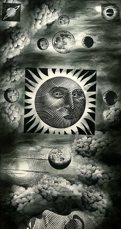
After stamping Cloud Space, in black a Colorbox Stylus tool was used to apply the Marvy "Black" to the Stampbord. A full tonal range of greys to black were achieved using the single pad. In heavier concentrations of the black ink, a darker incarnation of the black ink will build. Where the values are lighter greys, I achieved this by using a drier version of the Stylus Tool. This is an important point here. To achieve these subtle variations of whatever color inks you're using, you'll want to do this "dry brush" application of ink on your bords or paper. Build your values through repetitive tapping. The mistake is to re-ink your Stylus Tips too often resulting in potential "edges" of the tips showing on the scenes (oval shapes everywhere). Don't be afraid to have to tap ten times before you even start seeing some of the lightest values of whatever color you're using.
Using the Stylus Tool again, about 6 values of Ranger Distress inks and a Marvy #18 "Dark Brown" were applied to the scene staring with the lightest values. In this step, I've set up my lighting scheme for the scene. Knowing that I was going to apply texture and highlighting to the scene in another step, I wasn't terribly careful where I applied all of my colors but I was careful to not take things too far in toning things out that I planned on being either a light source or an object reflecting light. For example, I put some tone on the moons so they wouldn't be so start white but I didn't darken them with the darkest of my ink values. The same goes for my clouds. I wanted my clouds to be reflecting light so I was careful to not apply too much of the darker tones to the sides of the clouds closest to the light sources --suns, moon.
Using the two blades from the Deluxe Scratch Knife set" highlights, lighting, and texture were added by removing ink in areas throughout the scene. Highlights were scratched into each billow of the clouds, stars were added to the sky, texture was scratched into the deep space portion of the background, and the contours of the engraved style images were scratched into in the lightest areas of the objects to push the volumes (make the lightest areas seem lighter by carving out some of the ink that was applied). The "spoon" or rounded shape scratch knife nib was used to scratch wide and soft removals of ink where the pointed "spear" shaped scratch knife nib was used to scratch thin uniform lines througout the scene. Both were used equally.
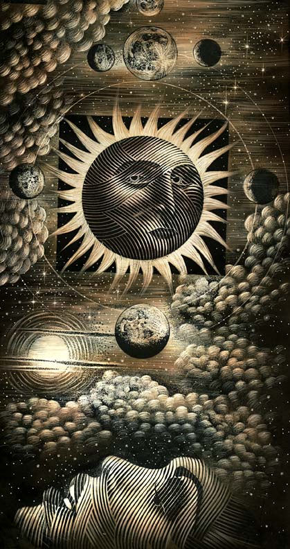
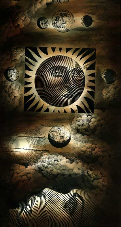
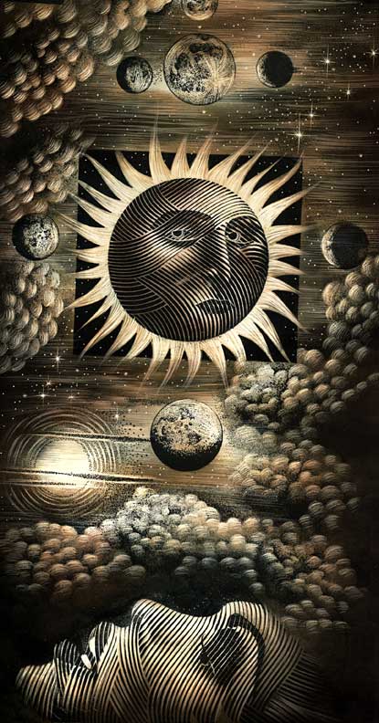
I thought I was done on the last step but I let it set overnight and looked at it more over the next day. I decided that I wanted to add more definition to the borders on the cloud edges and to increase the texture. To tighten the visual relationship between the sun and the moons carved concentric circles were made by putting a scratch knife in a compass and carefully finding the center of the sun and measuring the distance to the center of the medium orbiting moons and then another circle added to contact the larger moons. It was a fun scene to work and an excuse to use my moon phase designs that had been discontinued years ago and have been brought back on the unmounted sheets.
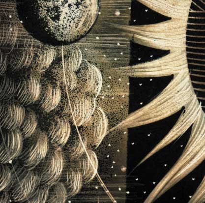
Detail/Close up.