by Kevin Nakagawa, CA 2007
8.5" x 11"
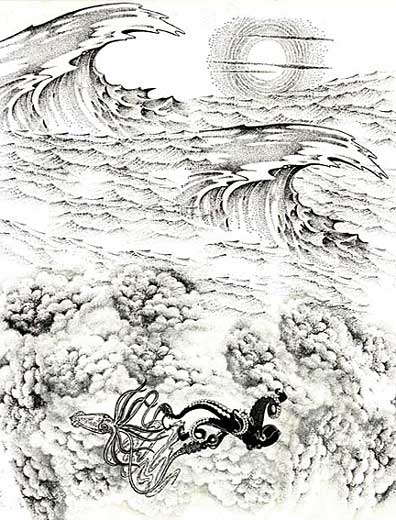
Images: Squid by Alice In Rubberland. Octopus by Fistfull of Stamps. The Great Wave, Waves (sm.), Hot Sun, and Cloud Cumulus by Stampscapes.
All images were stamped in a Marvy #1 "Black". The two impressions of The Great Wave were stamped first and the the smaller waves were filled in around them. I positioned the squid and the octopus on the lower half of the scene but they were in a large open space. I wasn't sure how I would address that amount of open space so stamped a circle of clouds around the animals for lack of better idea.
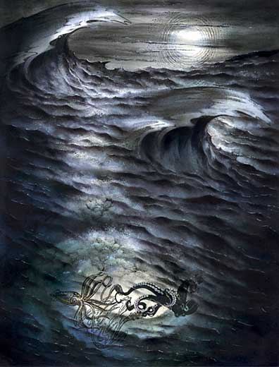
Marvy Black was used with a Colorbox Stylus tool to create a full tonal range of greys to black. In heavier concentrations of the black ink, a darker incarnation of the black ink will build. Where the values are lighter greys, I achieved this by using a drier version of the Stylus Tool. This is an important point here. To achieve these subtle variations of whatever color inks you're using, you'll want to do this "dry brush" application of ink on your bords or paper. Build your values through repetitive tapping. The mistake is to re-ink your Stylus Tips too often resulting in potential "edges" of the tips showing on the scenes (oval shapes everywhere). Don't be afraid to have to tap ten times before you even start seeing some of the lightest values of whatever color you're using.
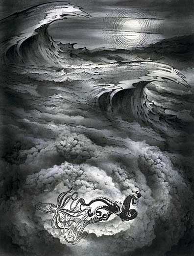
The lighting scheme has been established using this black ink and several design issues have been resolved or established. The first thing that I wanted to know was what I was going to do with the large waves. I wasn't sure how I was going to light them. For the most part I made them into large black voids to make them appear ominous. The Hot Sun stamp was used as a moon in this scene. I streaked in tone around it to make it stand out from the background but I wanted it eerie so I ran some of those greying streaks across the moon to darken it. Throughout the surface of the ocean I've oscillated lights and darks. My inclination was to leave the far water, under the moon, light where it would be catching the light of the moon the strongest but it wasn't working for me so I darkened the horizon to create a stronger distinction between earth and sky. The shading within the small waves was important to create an uneven surface on the water. I used ripped paper towels to create jagged edged masks and used them to make a shaded patterned body of water. I laid the mask over the waves and built up a little tone over the top of them and kept repeating the process. A similar approach was done on the clouds to create the shaded swirl. The subjects of the squid and octopus looked like they were floating on the water which I addressed later. I wanted them to appear as if they were under the water but still needed them to be amidst a lighter background so that the viewer could make out the shapes.
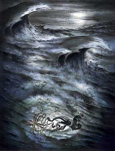
Okay, a lot has happened in this scene between the previous step and this step. I added color to the scene using several Clearsnap "Vivid" and "Ancient Page" dye based ink pads. Clearsnap sent me these pads about two years ago and I finally got around to going through them and using them. They have a lot of great colors! I don't know what happened to these pads over the years but the Vivid line was one of the first raised dye based pads on the market. I was looking for various blue hue and didn't want to use the Marvy Pads for my color here as I wanted a change. I came up with quite a few of my favorite blue tones such as Ultramarine which is a dark, almost black, blue. Others included Cobalt, Storm Blue, Aqua, Bermuda, Turquoise, and Neptune. Quite a nice variations of blue tones. Anyway, I layered these blues tones over one another to try and make the deepest blue that I could.
More small waves were added to the foreground area over the top of the clouds and the animals. The swirling clouds and animals needed to be pushed back, visually, in space. The waves, layered over the top, put the clouds, and animals under water.
White pigment ink was applied to the scene with a cotton swab. This created additional texture and atmosphere. One tip when using this is to apply the white ink slowly and in layers. I generally don't put much if any white ink over an area that doesn't have some lightness to it. It can look out of place in a dark area. A white gel pen added highlights.
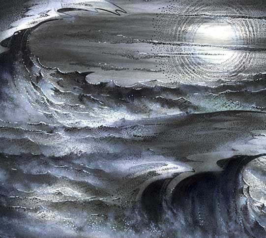
Detail/Close up.
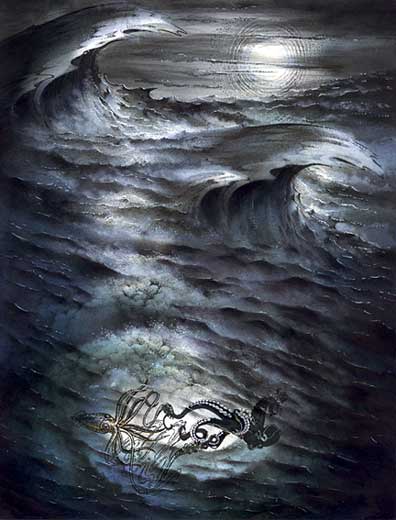
Alright, after looking at this scene the next day I decided that it "wasn't doing it for me". There was something lacking as far as drama and continuity. In this step I've darkened a lot of the waves and burried a lot of the white pigment ink work done. I wanted the ocean to look like a continuous deep body of light absorbing blackness.
Again, deepening of the shadows in the scene with more black ink. The horizon line needed a stronger value to separate earth from sky.
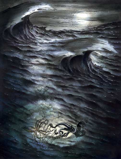
The two large waves needed more ominous bowl sections (the space underneath the crests). Originally, I had a lot of mist working up the curl which brought light into the space but it was the wrong inclination. A few more small waves were added into the scene for texture. It's funny how this scene started out being somewhat about a squid battling an octopus but, in the end, the scene ended up being more about the texture of water. ~KN