4.25" x 5.5" glossy card stock and dye based and pigment ink.
More of a before and after than a full lesson.
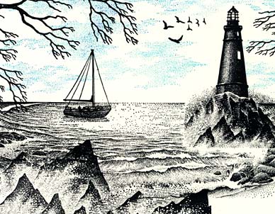
Black dye based ink: Light, Rocks, and Waves Sm. was positioned on the right side of the scene and was then masked using a paper towel. Seaside Cove Small was then stamped. Where the mask was positioned on the lighthouse stamp, overlapping waves didn't occur. Rocks and Waves were positioned in the lower left corner of the scene and stamped twice. Spooky Branch Sm., Sailboat, and Gulls were stamped. Cloud Space Sm. was stamped in a medium value blue (Marvy #10). All of these images are also available on one unmounted plate.
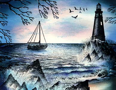
Using a Colorbox Stylus Tool with a white oval tip, a series of four blue values were used to color the scene starting with the lightest Ranger Sea Shells "Aqua". This light blue covered a large percentage of the scene but left some areas that I wanted the lightest highlights to be --parts of the crashing waves, spindrift, and streaks in the sky. The next light blue ink was Marvy #60 "Salvia Blue". It was used in almost the same places as the previous blue. The lighthouse was also colored with these blue tones but I avoided the windows of the image to make it appear as if light was coming out of them. Marvy #10 "Light Blue" was layered on the scene but this time used primarily on the perimeter of the scene and to deepen some of the shadows within the waves. To separate surface water from sky, the sky was masked and a dark thin line was added to the horizon. The next and final blue that was used was a Marvy #3 "Blue". Again, primarily used on the perimeter and to deepen the established shadows of the scene. Final ink used was a Marvy #1 "Black" to do what the previous two colors established with perimeter framing and deepening of the shadows but the black was used the most sparingly of them all.
Final touches on the scene were to use a very thin application of Colorbox "Frost White" pigment ink on the crest of some of the closest waves in the ocean and also on the crashing waves against the rocks. Again, use sparingly and in a very thin layer. I remove as much pigment ink, or more, than I put down. This pigment ink dries slow so it will give you as much time as you need to remove some of your applied ink if laid down too thick. A white gel pen was used to place highlights on the overhanging branch (underside of the branches due to the bottom lighting), in the splashing waves, and ocean surface.