Carved Light
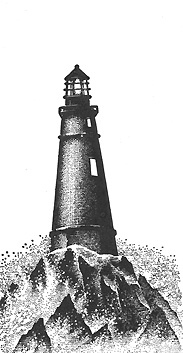
1) Light, Rocks & Waves 220G was stamped in black.
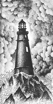
2) Cloud Cumulus 018E was stamped several times completely surrounding the lighthouse. Re-ink in between impressions.
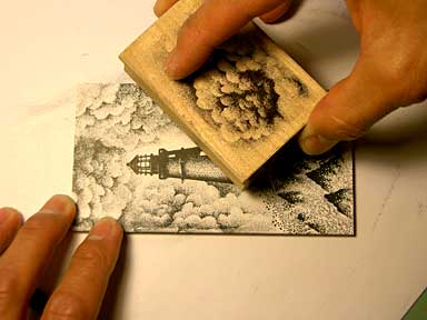
3) With a Colorbox Stylus Tool, black was added to the scene framing off the lighthouse. Note: some of the waves were left light as though some light was reflecting off them.
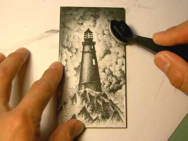
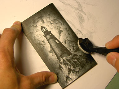
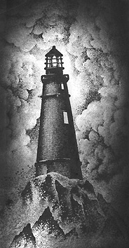
4) Ranger Industries Sea Shells "Ocean Aqua" was added to the scene with the Stylus Tool. This adds a little richness to the monochromatic composition. Also, in anticipation of carving back into the scene with a scratch knife, I wanted to add a darker value to the light areas of the card. In doing so, the carved areas will show up better (white against blue/grey/black).
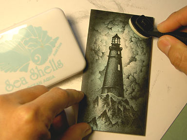
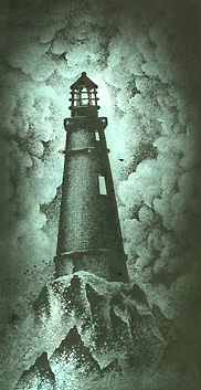
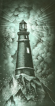
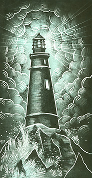
5) Some areas have been carved out in the scene. The light is beaming, the clouds are catching some of the light. The waves are splashing. But this didn't look finished to me so I added some additional marks. Note: a scratch knife is similar to a calligraphy nib in that it's a steel point that you fit into a standard nib holder. There are several types of scratch knife points. Some look like a spear, some look like a little sharp pointed scoop, some look like a micro butterfly knife. They all work but they're geared towards different marks. I use the Speedball model 113.
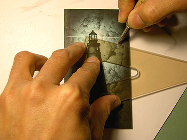
For straight lines, use a straight edge
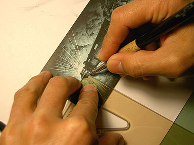
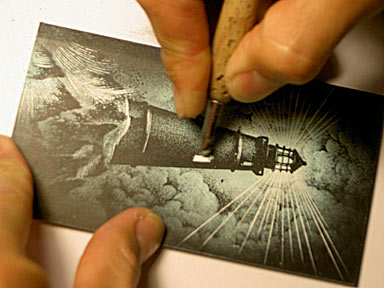
Here, I'm scratching off some tone on the window. In doing so, it looks like the light is on inside the building.
Okay, I might have gone a little too far here but I like the look. I think the marks have become more confident and the heavier line weight of the scratched areas gives this scene a little more of a carved appearance. It tends to flatten out the image but texture and shape make up for illusionistic depth. A very different look. It's a good way to get a lot of mileage out of your stamp design --by making your end results so different from the initial impressions.
