Fall Forest
1) Using a Ranger Industries BIG and Juicy "Waterfall" pad, ink was brayered on to the card horizontally.
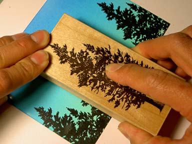
2) Spruce Lg 078F was stamped five times in black changing the height of each impression. Re-ink in between impressions.
3) Spruce Lg 078F was stamped again but this time in a Marvy #3 Blue (basic royal blue type of color). But here, I did something different. I faded the impressions out on the bottom to avoid obscuring the first black impressions.

Here I'm wiping, with a dry paper towel, ink off the stamp. I wipe more ink off the bottom of the stamp where I anticipate an overlap of the black trees and as I wipe up the tree, I wipe off less and less ink. That way there will be a transition.

Stamping the Spruce.

Impression is complete. Notice the lighter value of blue towards the bottom of the blue spruce. It's a little streaky but, hey, let's call it fog.
4) Pine Row 150E was stamped twice in a blotted Marvy #10 Light Blue. I thought having it straight out of the pad, it might be too dark and thus the blotting. I treated the bottom of Pine Row the same way I treated the the blue Spruce Lg --I wiped off a little ink off the bottoms of the row so it would fade into the blue spruce trees. What I'm doing with these layers of trees is I'm getting lighter and lighter with them depicting distance --in a color out of the theme of the rainbow pad (blue).
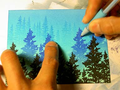
5) The scene looked fine as it was but here I've added a few gel pen dots to the trees to add that extra little touch. These add texture, highlights, and even further separation between the layers of trees. A very quick but effective scene using two stamps. You could even just use the one Spruce Lg again in place of the Pine Row. Just stamp the Spruce in that blotted light blue --and wipe off the bottom.

I like adding these highlights to the top edge of objects. This isn't a formula but I usually start there.


