Herbal Falls
1) Ranger Industries BIG and Juicy "Herb Garden" was brayered on to the card.
2) Babbling Brook 183G and Brook Falls 184G were stamped in black.
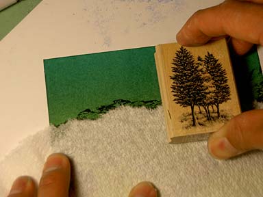
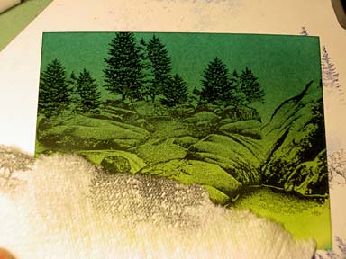
3) Tree Cluster sm 266D was stamped in black. I have them behind the falls so I masked off the rocks.

With a ripped paper towel I masked off the rocks. I like a ripped edge as opposed to an unripped straight edge as I think it creates a softer more organic transition. The rocks are curved so I have a curved mask. Notice also, how around the mask, I have some of the rocks showing. I do this because I want to avoid, if possible, having empty space in between the object being masked and the object being stamped. If the tree overlaps a little of the rocks it's not a problem but that looks better than a bunch of empty spaces everywhere. We want continuity and blending in scenic stamping anyway.

I've stamped the Tree Cluster four times here. Re-inked in between impressions. I've also staggered the heights of the impressions to avoid monotony and increase variation. This is important when you're using one image to represent a field of objects --unless you're specifically going for a symmetrical statement.
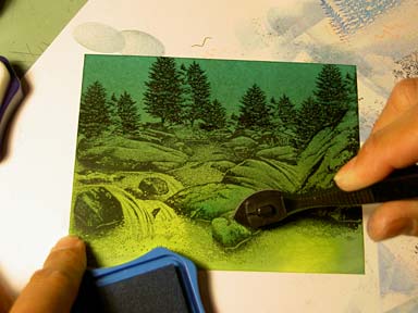
4) Marvy #60 Salvia Blue (a light grey-blue) was added to the scene with the Colorbox Stylus Tool. I wanted to add some surface to the scene by streaking in some blue into the water and to add some mass to the rocks.
5) Marvy #10 light blue (a light grey-blue) was added to the scene with the Colorbox Stylus Tool.

Here, I'm adding additional mass to the rocks. The darker color, in comparison to the area of the scene that was yellow/yellow-green, adds shadows and volume to objects.
6) Wading Fisherman 186B and Reeds Lg 068D was stamped in black. Yellow gel pen dots were added to the scene. I've outlined some of the tops surfaces of rocks, placed a few dots on the tree tops, and added quite a few "sparkles" into the flowing water and where it's falling in the illuminated pools.


