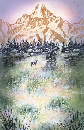
Wildflower Meadow
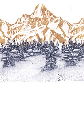
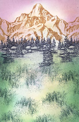
Tall Peak-182G was stamped in Ranger Industries (R.I.) Vintage Ink
Apple Cinnamon and Meadow Lg-057G was stamped in Marvy Black #1.
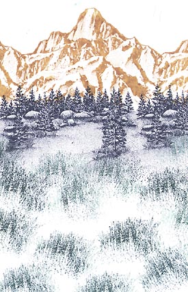
Grass Texture-208D was stamped several times in (R.I.) Adirondak Bottle. Vary the angles a little when you stamp this image.
Overlapping will also help to prevent an appearance that looks too uniform.
The Tonal Applicator-084E was used in (R.I.) Sea Shells Starfish Green in the meadow and Cool Peri on the mountain and sky. The Sea Shells line are good colors to begin with when it comes to using the Tonal Applicator. They're very light values and set nice foundations for the progressively darker colors that we build up in the process.
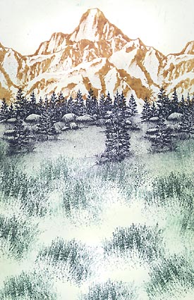
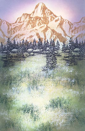
The Tonal Applicator-084E was used in (R.I.) Sea Shells Sea Grass in the meadow and Tropical Raspberry on the mountain, sky, and a little in the grass --here and there (not over everything). This is a perfect illustration of another reason I like the Sea Shells line. I've overlapped much of the previous colors and these inks just blend in perfectly with their siblings. I had wondered what people were using these inks for (as they're so light) and I noticed on the Ranger Industries site they mention that they're good for coloring black and white photographs --which makes perfect sense as you don't want photo inks to be too dark.
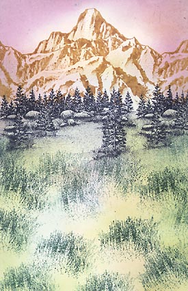
The Tonal Applicator-084E was used in (R.I.) Sea Shells Peach Bellini on the mountain and grass. (R.I.) Vintage Ink Lavender was used in the sky.
The Tonal Applicator-084E was used in (R.I.) Sea Brights Awning Green on the grass. Note that I didn't use this green over the entire grass area. I wanted to leave an area of light in the scene so I'm doing this by not stamping the darker colors "in" as far as I did with the lighter Sea Shells line.
The Tonal Applicator-084E was used in (R.I.) Adirondack Pesto on the grass. (R.I.) Vintage Ink Spring Floral was used in the sky and sides of the mountain. Getting darker here and the composition is becoming more contained/framed.
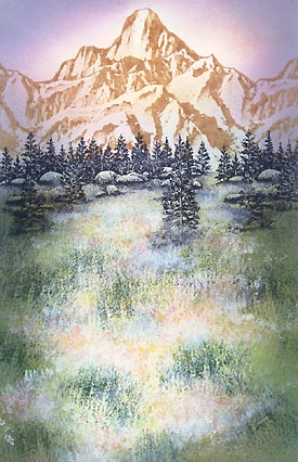
Grass Texture-208D was stamped in Colorbox Frost White. I just kind of dabbed this image around. I didn't go for the entire image impression. The Colorbox line is a pigment ink line. I know what you're thinking --they don't dry on glossy paper. I've used them in light coats with a cotton swab application but never "image stamped" on glossy. I wanted to bring opaques into the mix with this scene so I just sprayed a light coat of Krylon Crystal Clear over it and it seemed to do the trick. Note: You want just that --a light coat. When you give it too strong of a coat, the inks tend to disappear into translucency/transparency.
The same thing was done with Colorbox Marigold, Orange, Lilac, and White colors. I was interested in trying for a CA poppy, lupine, paper white look. Spray with Krylon.
Colorbox White and Robin's Egg colors were applied to the grassy area of the scene with a cotton swab. The previous step left the scene a little too textural for me so I wanted to diffuse it with some misty/foggy areas. White was applied and, to give those (cloudy) areas a little dimension, the Robin's Egg was applied to the base of the cloud-like shapes. Note: Take a lot of the pigment inks off of the cotton swabs by dabbing them off before applying to paper. It's like semi-dry brushing.
Reeds Lg.-068D and Buck-008A were added using black.
A Pentel Milky Gel Roller in the colors of White, Peach, and Pink, were used to add highlights/flowers in the meadow.

Size of Original 5.5" X 8"
