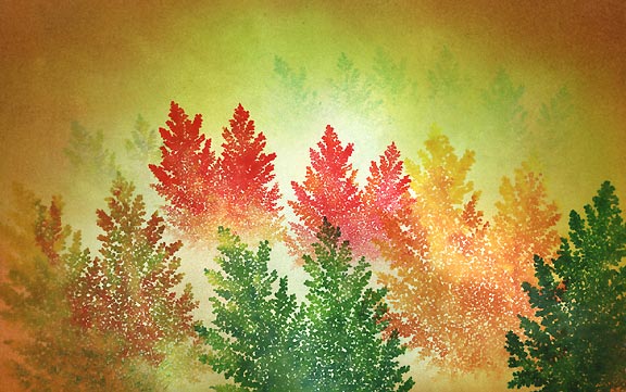
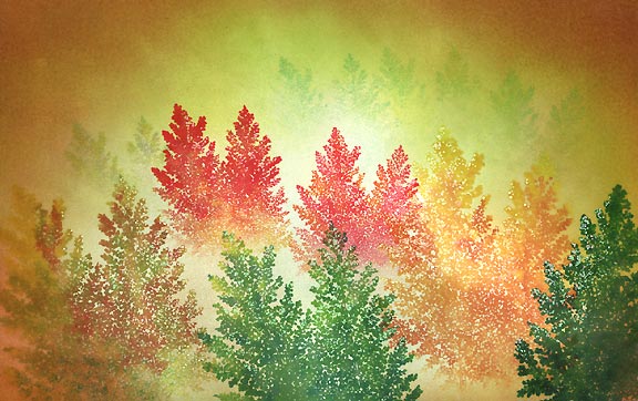
Autumn Mist
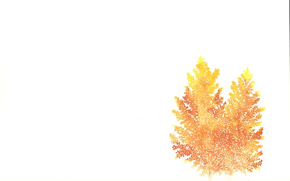
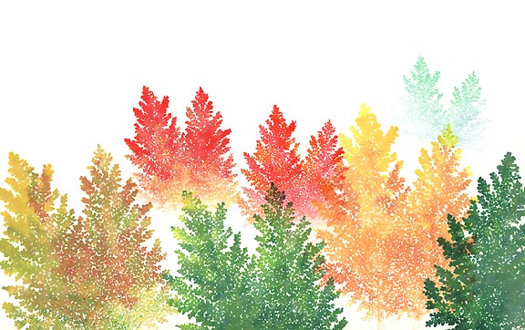
Quaking Aspen-238G was colored --directly on the rubber-- with dye-based pens and pads. I gave it a good coating with a basic yellow, then --with pens-- I added a basic orange and a more "pumpkin" orange. Then back to the yellow pen, I blended the colors a little more --got rid of the streaks (Yes, it made my yellow
pen tip a little orange, but I just wiped it on a piece of scratch paper. It stains the tip but doesn't really affect the pure yellow if you wipe enough of the orange away). The pens I use in this lesson are the large brush markers from Uchida --Marvy.
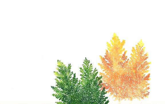
The Aspen was colored the same way. This time using about two shades of green and a yellow. I started with a Marvy Pine Green #72, went back in with a Marvy Light Green #11 in areas and then with a yellow -colored some of the tree tips. Note, This second tree is quite a contrast against the first one. The reason is that I wanted to be able to visually distinguish the depth between the two trees --I didn't want them to just
all blend into one blob. I'll do this continually with the ensuing impressions.
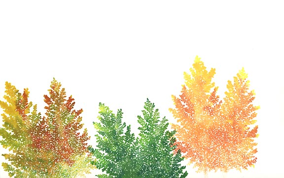
This tree really got the treatment. I think I used yellows, brown, a little red, some orange, lime green, etc. Don't ask me in what order though. The trick is to do it in spots and to blend them in a little -to avoid a streaky look. Note the lower right-hand corner of the tree and how it's very light. I blotted (wiped off) a great deal of the ink so that it stamped lighter, and it wouldn't interfere with the silhouette of the second green tree. I'll do this later with the background trees as well.
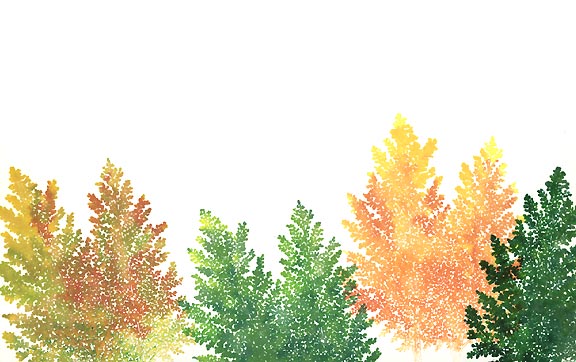
The scene was starting to look a little too light to me so I wanted to bump up the contrast a little. I stamped this fourth impression in a Marvy Pine Green #72. I dabbed a little Green #4 in for variation.
Quaking Aspen Small-237E was colored in a nice bright red as I wanted to extend the color range of the scene and increase the intensity. Note how the bottom of this impression is lighter. Two reasons: I blended in some light orange in that area, and again, wiped/blotted it off down there. If I didn't, you wouldn't be able to see the shapes of the tree tops of the impressions lower on the scene.
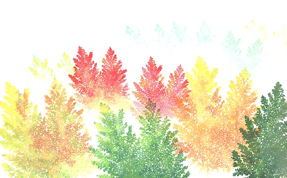
Two more impressions of Quaking Aspen Small. Note the second reddish colored one and how it overlaps that first impression that I made. I should have lightened this second reddish colored tree as we can't see the branches of the lighter tree now. Oh well. The far tree was done in a Marvy Pale Green #34 and Marvy Salvia Blue #60.
More background trees added. You can hardly see then in the scan, but they're pretty light in the original.
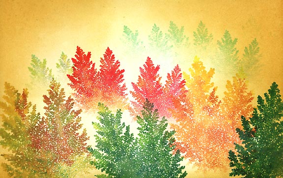
Tonal Applicator-084E was used in a Ranger Industries Sea Shells line Starfish Green. Sea Shells are extremely light, fairly bright, colors perfect for initial Tonal Applicator applications. I left some of the area, towards the center of the scene, the white of the page for value variation.
Sea Shells Sandal was applied with the Tonal Applicator.
Marvy Brown #6 was applied. The composition really starts coming together here. A cohesive feel.
I thought I might want to introduce a brighter color from the color scheme of the green trees into the surrounding tone so I went light again with a Ranger Industries Sea Brights Citrus which is a yellow-green color.
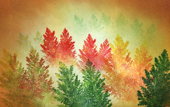
Time for some highlighting. I wanted some of the tree leaves to shimmer in the light. Milky Gel Rollers were employed in pastel tones. On the green trees I used green, yellow and white. On the yellow/orange trees, I used yellow and white. On the red trees I used pink, orange, and white. In other words, I used pastel versions (gel markers) of whatever colors were used on the dye ink aspen images. See before and after close up files below.
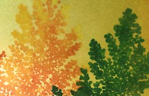

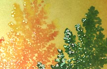
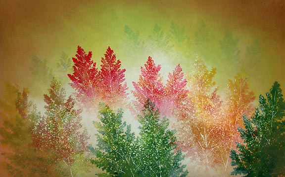
Here's where it really gets fun. With a pigment ink like Colorbox Frost White or a Tsukineko Brilliance Moonlight White you can dab some mist into your scene. With a cotton swab, I applied that haze into the scene with a somewhat drybrush application. You don't want a thick smear of this ink so dab it off until your cotton swab gets a little flattened out, and the tip softer and wider. I apply this mist in several extremely light layers. Where I want it lighter, I apply more layers. Build it up gradually --allowing each layer to dry for the most part-- otherwise it tends to look a little heavy handed. In this scene, I applied it around some limbs mostly on the side of trees that was being illuminated by light (light's coming from the center of the scene).
For a final touch, I used a white Milky Gel Roller to draw in some tree trunks which gave them a little more depth I think.
