A Walk in the Park
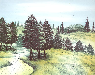
"Crooked Path" 146F and "Tall Grass" 253D were stamped using Uchida Marvy Bottle Green #25. Tall Grass is in there three times.
"Sedge Filler" 251C was stamped twice in a Marvy #72 "Pine Green" to top off this hill.
"Sedge Filler" 251C was stamped in in rows using Marvy #72 "Pine Green'. These rows will represent background hills and were stamped at two different angles so the depth would be easier to differentiate.
"Tree Cluster" 244E and "Tree Cluster sm." 266D were colored and stamped out in a Marvy (pens) "Pine Green #72", #25 "Bottle Green", and #18 "Dark Brown". The multiple inks/colors create variation in the impressions.
The top of "Tree Cluster sm." 266D was colored and stamped in Marvy Pine Green #72 and Green #4. These are behind the near ridge/hill so, to do so, the grass line was masked out before the impressions were made.
For the far hills, "Maple Trio" 240B, Tree Duo Lg. 086B, and Fir Row 243A were stamped in Marvy Pine Green #72, Bottle Green #25, and Green #4. Again, the hills were masked out before the impressions were made giving the scenes the appearance of the trees being on the far sides of the hills. These trees help to visually separate the hills in terms of depth. The farther the hills, the smaller the trees become.
The Colorbox Stylus Tool was used in a Ranger Industries (R.I.) Sea Shells "Conch Shell" in the grass and trees and in (R.I.) Sea Shells "Ocean Aqua" in the sky. Conch Shell is actually more yellow that it looks in this scan but as I applied the ink to the paper, it started picking up some of the green ink from the impressions. I left some of the path a little light along with some of the meadow grass to the right of it. For the sky, I streaked/dragged in the blue from the edges of the card -inward. I left two elongated areas the white of the paper to represent clouds.
If you don't know what the Stylus tool is you can check out clearsnap.com. How I use it is basically to just sponge my color on to the scene using one of the tips. My preference is the oval white one.
Stylus Tool: (R.I.) Sea Shells "Cloudy Blue" was used in the sky basically going over the same areas as with the "Ocean Aqua" and Marvy "Ochre" #13 was added to the grasses. The lighting scheme is starting to take shape with these colors.
Stylus Tool: Marvy "Salvia Blue" #60 was used in the sky -again going over the same areas as with the "Ocean Aqua"/"Cloudy Blue" and (R.I.) Sea Shells "Starfish Green" was added to the grasses. The cloud definition becomes a little bit more apparent. Still being careful here not to completely tone out the meadow area so we can maintain the variation in value there.
Stylus Tool: (R.I.) Sea Brights "Citrus" was added in the grass and trees. Sea Shells "Sandal" was added to the path. R.I. Sea Brights "Sailboat Blue" was added to the sky. I didn't cover up all of the previous blue with this one as I wanted the variation of the light and darker blues to exist.
Stylus Tool: R.I. Adirondak "Pesto" was added to the lower portion of the path --I still wanted an area of the path to remain light (variation). Marvy "Pine Green" #72 was added to the grassy areas --mostly in shady areas like under the trees on the various hills. Marvy "Bubble Gum Pink" #67 was added to the sky --used in selective areas so as to maintain some of the straight blues and light areas of the cloud centers.
Stylus Tool: A Marvy "Brown" #6 was used on the path and grass. Marvy "Bottle Green" #25 was used in the grass. The area to the right of the path that's still illuminated, in my opinion, is more effective this way that if it was one continuous dark tone.
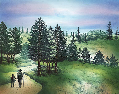
"Hiker & Child" 165A was stamped on the path in a Marvy "Black" #1.
"Reeds Lg" 068D, "Reeds" 067B, and "Leaf Sprig" 127A were stamped in the foreground in Marvy "Black" #1
Q-Tip: Using a "dry brush" touch with [pigment inks from] Colorbox "Frost White" and a Brilliance Pad "Moonlight White" the cloud tops were defined and a fog/mist was created at the paths end and behind the trees to the right of the path (which helps to further differentiate the separation/depth between the hills).
Add sparkle and highlights to your scene with Milky Gel Rollers. In this case Pentel pastel colors in white, blue, green, and orange were used. These colors related to the color scheme used with the dye based inks so I used them here with the gel pens. These dots really pick up the grass modulations and add dimension to those surfaces. Overall, this added texture (dots) helps to create continuity between the different stamps and the different sections (road, path, trees). They put the "enchantment" into an enchanted landscape.
There was still something that was missing in the scene and I think the deciduous trees were the problem. They needed some brighter color so some yellow was added to them. Also, some shadows were added to the hikers that reinforced the lighting direction and seemed to put on the finishing touch. These shadows also anchored the figures to ground. In comparison to the step before, the figures seem like they're floating. The shadows were just lightly streaked and dabbed on to the path using a small rolled up paper towel.


