The Stampscapes® 101: 9-Step, Lesson V, Frames 1-9
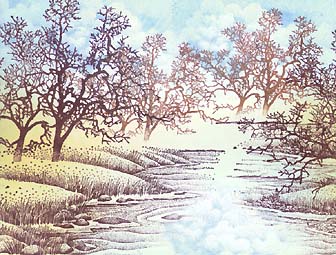
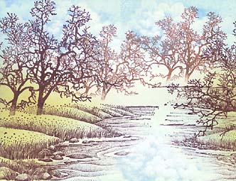
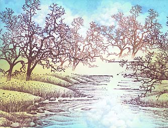
Oaks & Stream
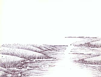
Waterside Bluff Left 148F and Right 149F were stamped in #18 Marvy Uchida "Dark Brown". Note: the right bluff was stamped twice --stacked.
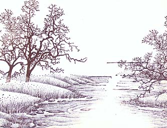
Oak Tree (Large) 179G was stamped in #18 Marvy Uchida "Dark Brown".
Note: Two impressions were made at staggered heights. On the image to the left, I wiped off some of the ink towards the bottom of the trunk to soften the area where it meets the grass.
Oak Tree (Medium) was stamped twice in a combination of #18 Marvy Uchida "Dark Brown" and the #6 "brown". Note: The reason I used the two was for variation and I felt a direct application of the #6 was going to be lighter than what I wanted. The bottom of the trunks were softened as the large oak was.
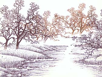
Multiple impressions of Cloud (Cumulus) 018E was stamped in both the sky and the water in #60 Marvy Uchida "Salvia Blue".
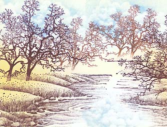
The Tonal Applicator 084E was used to flesh out the land --grassy area-- in #16 Marvy Uchida "Pale Orange". Note: #16 is a very light hue and is a good color to begin with in the color building process. I wanted it primarily on the land but I occasionally took some very light taps of it into the sky and water to prevent a "fragmented" look (Too clear cut distinctions between areas of different colors --ie. sky = blue, grass = golden brown, water = blue w/o any of them blending).
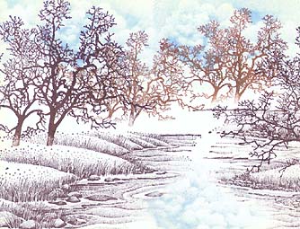
The Tonal Applicator was used to start bringing in color to the sky and water in a Ranger Industries Sea Shells "Ocean Aqua" pad. Note: As with the #16 "Pale Orange", in the last color used, this Ocean Aqua is a great blue to start out with. The entire Sea Shells line are great starter colors in that they're all just barely darker than the white of standard white paper. I call these types of colors in these light values "foundation colors". They start out the toning process with very light and, often, bright colors. Great colors to build on.
The Tonal Applicator was used to add a slight "greenish" color to the golden grassy area in Ranger Industries Sea Shells "Sea Grass" pad. Note: This green gives the golden grass and blue sky something in common --there's a bit of blue and yellow in this green. The colors starts to unify the different areas with color.
The Tonal Applicator was used to brighten and darken the sky and water area in Marvy Uchida #36 "Manganese Blue". Note: There are bright -light- colors and there are bright -dark- colors. Value = the relative darkness of a given hue or shade. Intensity = the brightness of a given hue. This blue used to be one of my favorites in the Uchida line due to it's light and bright nature. By taking the darker areas of the sky and water a step darker, it makes the clouds seem one step brighter by contrast.
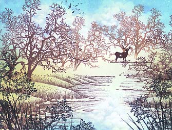
Oak Branch 203G, Flock112A, & Reeds Lg. 068D were stamped in Marvy Uchida #1 "Black" and Buck 008A was stamped in Marvy Uchida #18 "Dark Brown". Note: The Oak Branch and Reeds Lg. help to extend the depth of field in the scene by adding something very close to the viewers eye. The flock of birds and buck help to enhance the midground and background while adding a great deal of visual interest to the scene. I felt I wanted the buck to stand out against the background oak trees but thought black might be too dark so the dark brown was used again. If it was stamped too lightly it would look like it was a part of the tree and if it was too dark it might be a bit obtrusive to that area of depth in the scene.
Return to Stampscapes® 101 9-Step Progression Lesson Outline
Go to the Stampscapes® 101 3-Step Progression Lesson Outline
Go back to the STAMPSCAPES® home page