The Stampscapes® 101: 9-Step, Lesson II, Frames 1-9
A Sunday Stroll
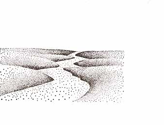
Crooked Path-146F was positioned. Colour: Marvy Dark Brown #18.
To fill out the right hand side of the open area (where the Crooked Path wasn't stamped out), the Grass Texture-208D was stamped. Colour: Marvy Dark Brown #18.
A single stamping of the Grass Texture wasn't enough to fill out the entire area of open space so multiple impressions were made (four more). Re-inking with each impression. The Grass Texture was designed to overlap itself. Colour: Marvy Dark Brown #18. Note: The texture was stamped basically on the lower half of the card only. While it could be used in the upper half, I wanted it to represent the grass nearest to the viewer. The grass gives the scene a nice element of rich texture.
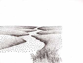
Oak Tree (Small, Medium and Large) Small-177B was stamped three times towards the top of the Crooked Path. Oak Tree Medium-178E was stamped towards the middle of the Path (and to the right side). Oak Tree Large-179G was stamed towards the bottom of the Crooked path and in the Grass Texture. Colour: Marvy Dark Brown #18. Note: On Oak Tree Large, the entire stamp was inked up but before making the impression, the bottom of the trunks were wiped off a little. I didn't want the trunks to end abruptly with a crisp line. This way the trunks kind of fade off into the grass.
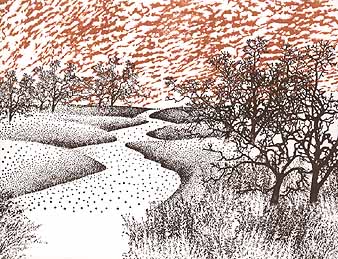
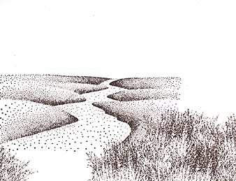
Cloud (Altocumulus)-193E was stamped across the sky. Colour: Marvy Brown #6. Note: The Altocumulus cloud gives a nice rich texture to the open sky. The white cloud formation created by the brown negative space are a nice contrast to the hard edged tree limbs.
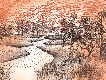
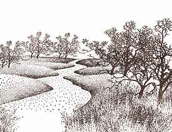
Applying tone. The Tonal Applicator-084E was used to apply my first layer of "glazed/layered" hue. Colour: Marvy Pale Orange #16. Note: The Tonal Applicator is basically another method of "sponging". Color is applied with the use of this tool. I wanted my Path to stand out so I largely avoided applying tone over that portion of the card. The same goes for some areas of the sky. I want some areas to stand out so I left it the "white" of the card.
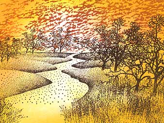
The scene was looking a little dull so I've applied another tone to the scene using the Tonal Applicator. I've layered the yellow right over the pale orange and worked it into a large portion of the card. Colour: Marvy Yellow #5. Note: Most of the dye based colors that come in pen or raised pad mediums are transparent. I've layered Yellow over the Pale Orange but the two are working together in that I'm covering but not making invisible the under color. With transparent hues, the colors under other colors will always "read" on the surface.
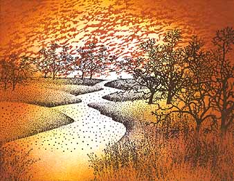
More tone was added to the outside of the card using the Tonal Applicator. Colour: Marvy Brown #6. Note: In order for the card to appear like it transitions from light to dark --from the inside out-- I don't take the tone in quite as far as the previous color used. Pale Orange goes in the closest to the centrer of the card. Yellow blends in almost as far but not quite. Brown goes in about 1 inch into the card. The darker you get, the less "in" you take it. On a white card, we're not working so much with "light" as we are with contrast. Everything is relative. The darker you take the scene in some areas, the "lighter" the lights will seem.
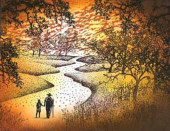
Even more tone was added with the Tonal Applicator to the corners of the card. Colour: Marvy Dark Brown #18. Portions of the Oak Branch-203G was used in the top and side portions of the card. Colour: Marvy Black #1. The subject matter of the scene was added. Hiker & Child-165A was stamped on the path. Colour: Marvy Black #1.
Note: The oak limbs in the foreground give the scene depth. Suddenly we have something very close to us. The dark limbs also increase the value range of the scene --the dark black limbs contrast against the light sky. The texture range is extended in the scene wit the the hard craggy limbs set against the soft cloud formation. The extra dark brown corners help to frame off the scene much as a studio portrait photograph has the dark edges around it's subject matter. It "contains" the piece.
The Hiker and Child or Oak Tree branches could have been stamped in the scene right from the start but I decided to wait and see how the card developed.
Return to Stampscapes® 101 9-Step Progression Lesson Outline
Go to the Stampscapes® 101 3-Step Progression Lesson Outline
Go back to the STAMPSCAPES® home page